Shine & Sierra – brand and packaging.
Shine & Sierra began as a branding and packaging initiative for an emerging London-based start-up, with a clear objective: to position the business distinctively within the premium organic wellness market.
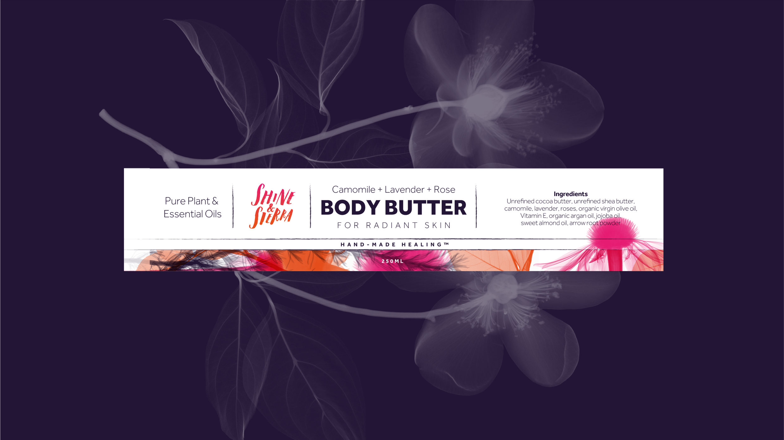
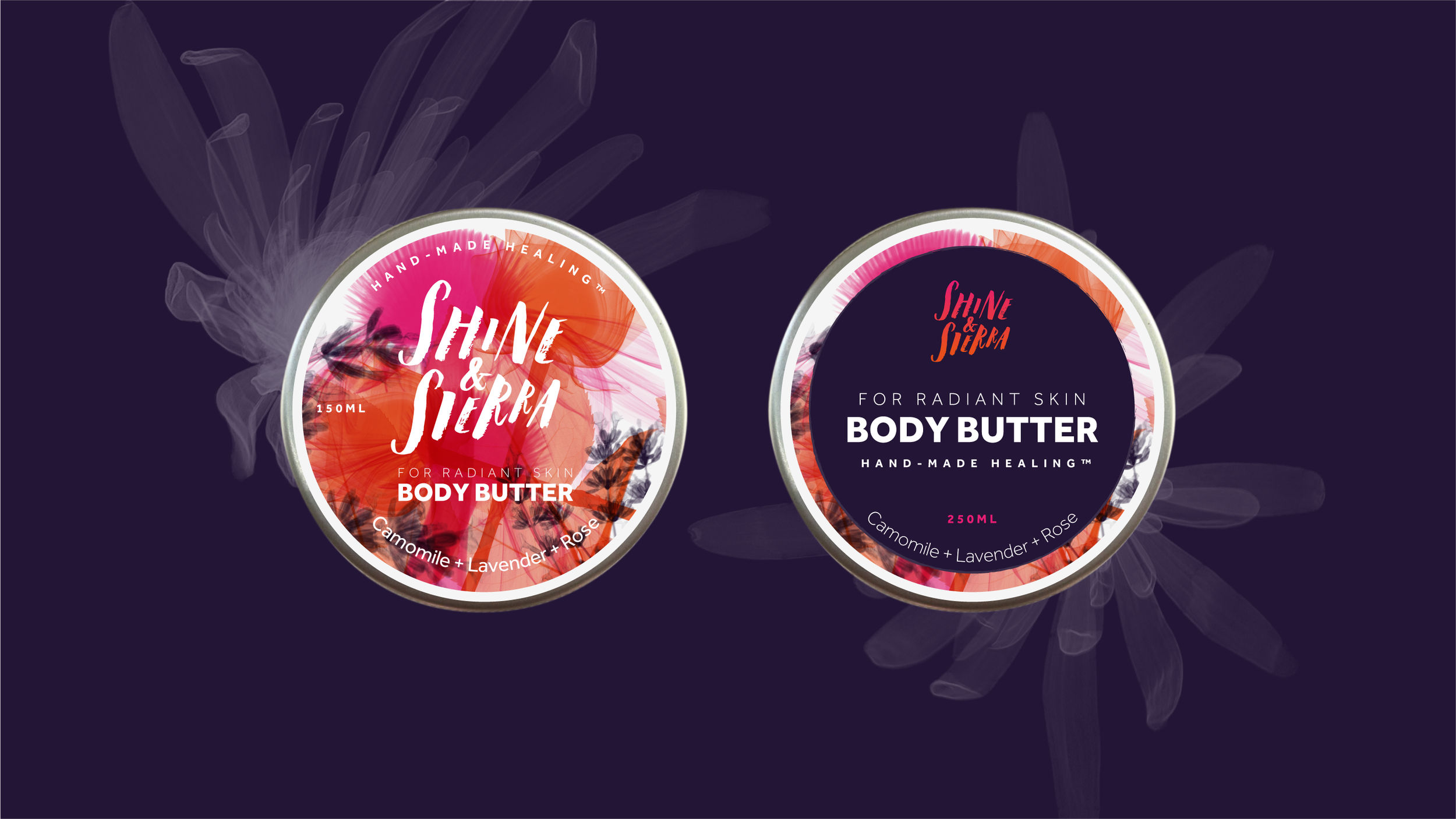
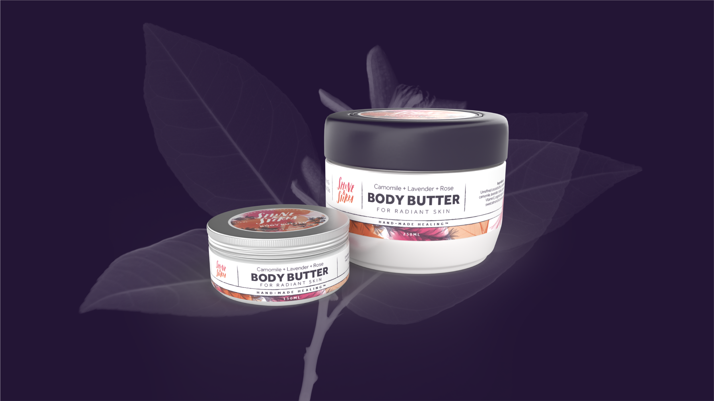
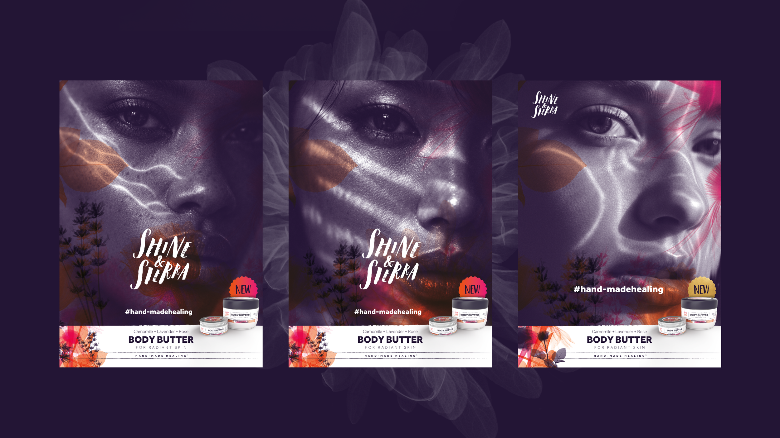
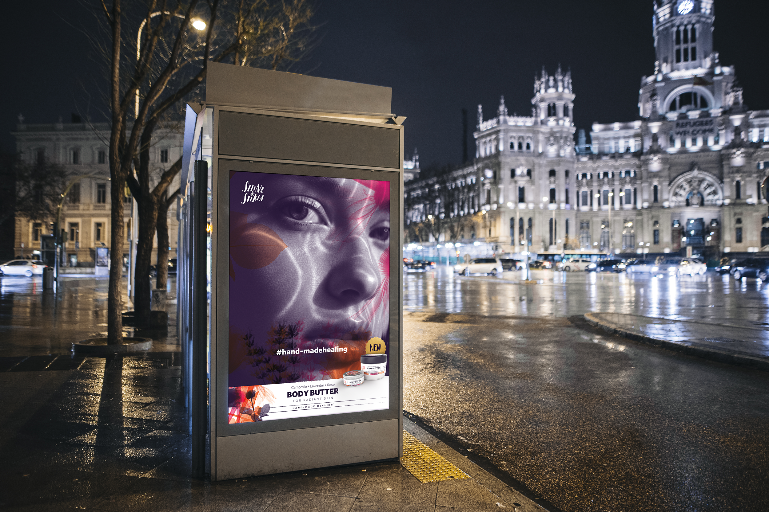
The strategic concept centres on the use of X-ray photography to reveal the intricate structures of key botanical ingredients – camomile, lavender and rose – transforming transparency into a visual storytelling device. By showcasing what is typically unseen, the brand communicates purity, provenance and product integrity in a sophisticated and unexpected way.
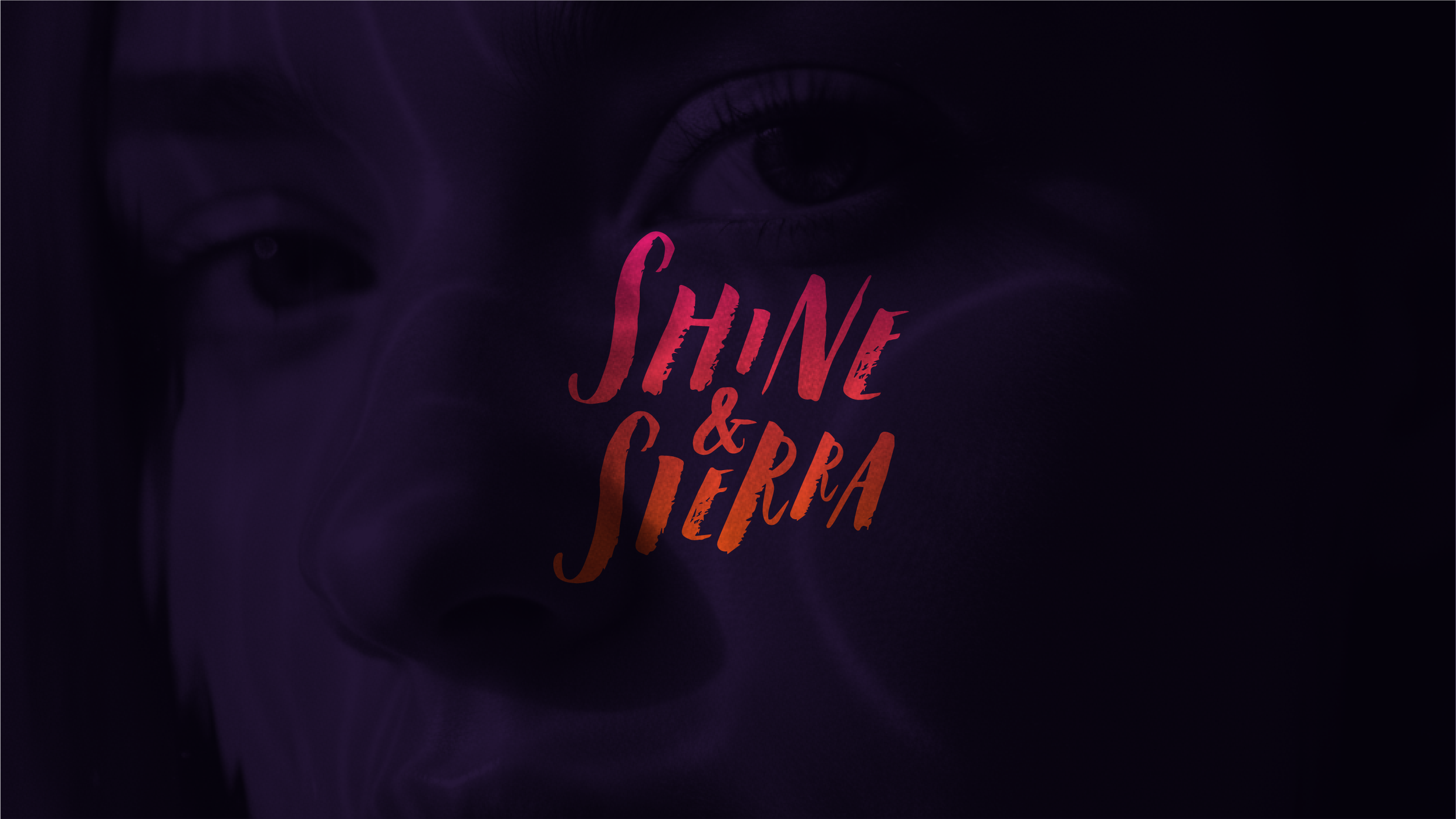
This scientific yet poetic visual approach is amplified through a rich, bold and dynamic colour palette, carefully developed to differentiate the brand on shelf while reinforcing its organic ethos. The result is a confident, contemporary identity that bridges natural authenticity with modern refinement, designed to build recognition, trust and long-term brand equity.
Available for purchase.
Copyright © 2020 GHDC Ltd. All rights reserved.