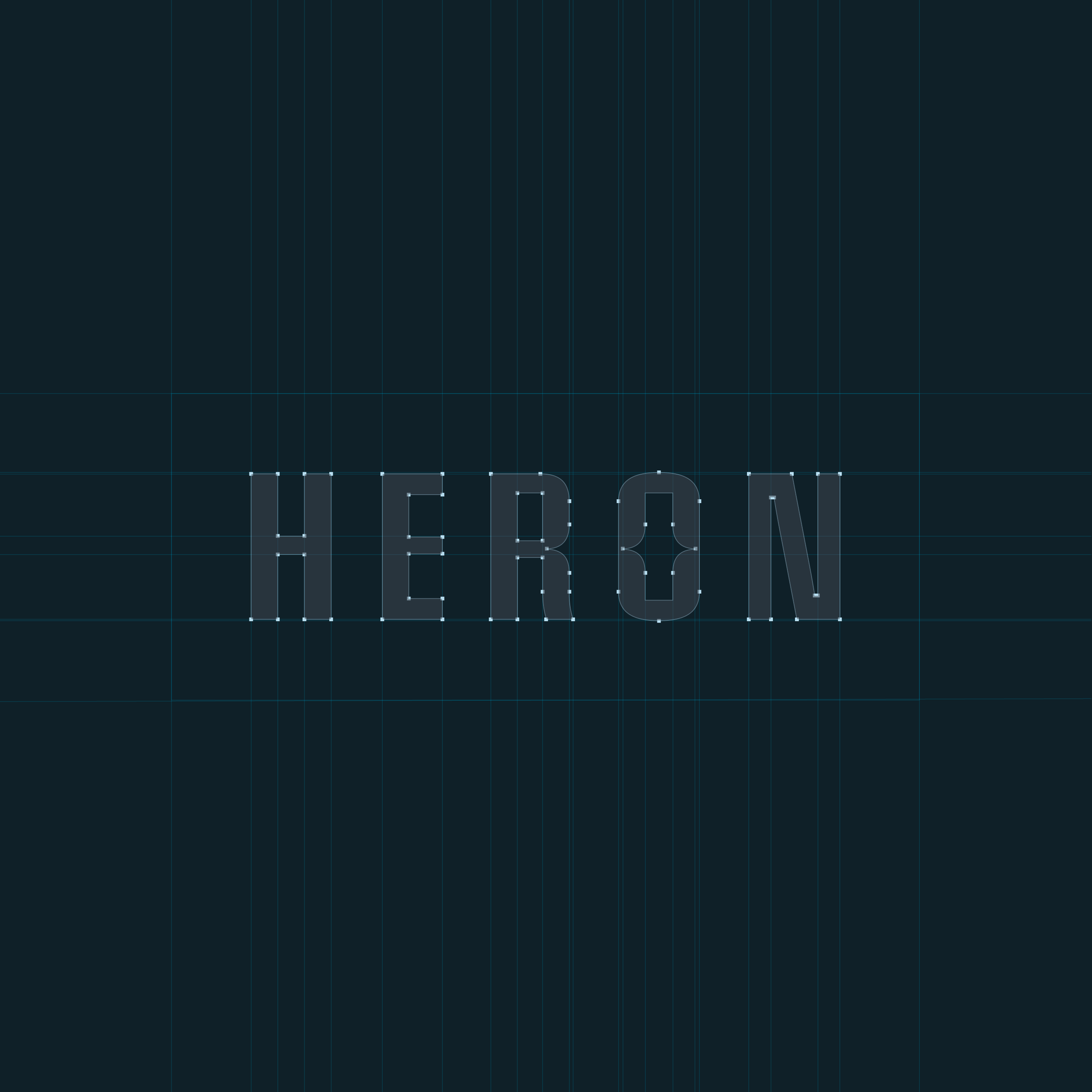
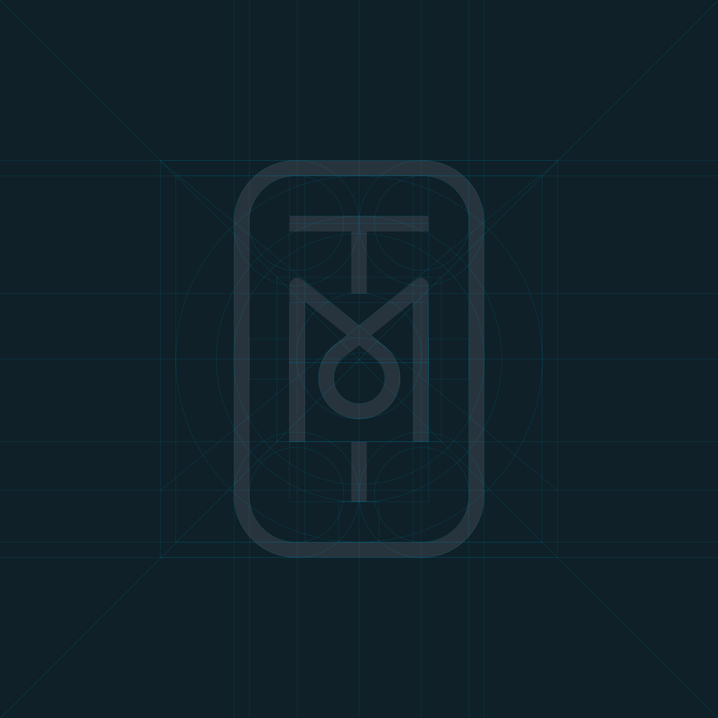
Heron Gin - brand and packaging.
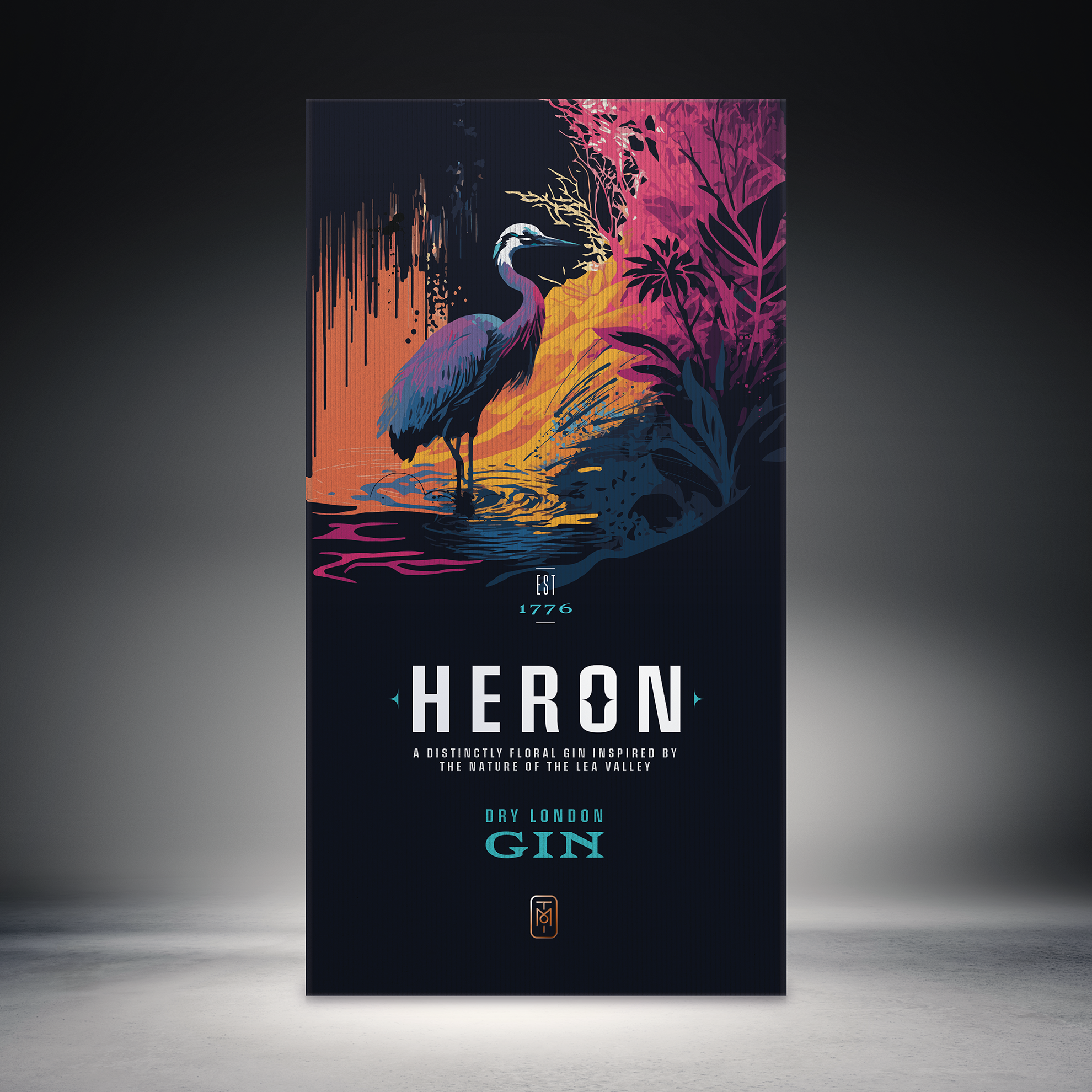
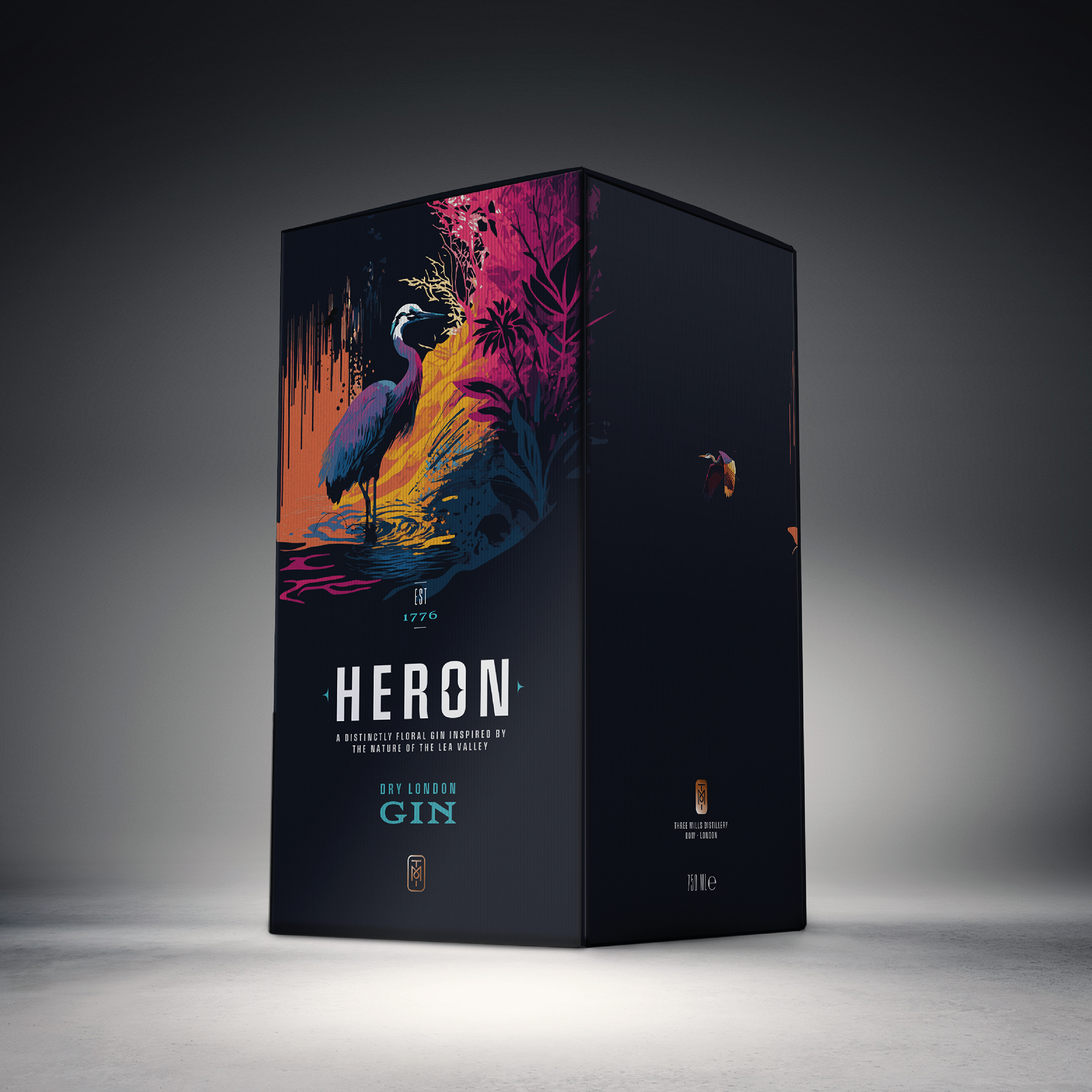
Three Mills, Bow — once the beating industrial heart of East London, powered by the tidal River Lea. In 1873, J&W Nicholson & Co distilled their celebrated London Dry Gin here, on a site that had been milling since 1727, founded by three Huguenot craftsmen whose spirit of precision never really left.
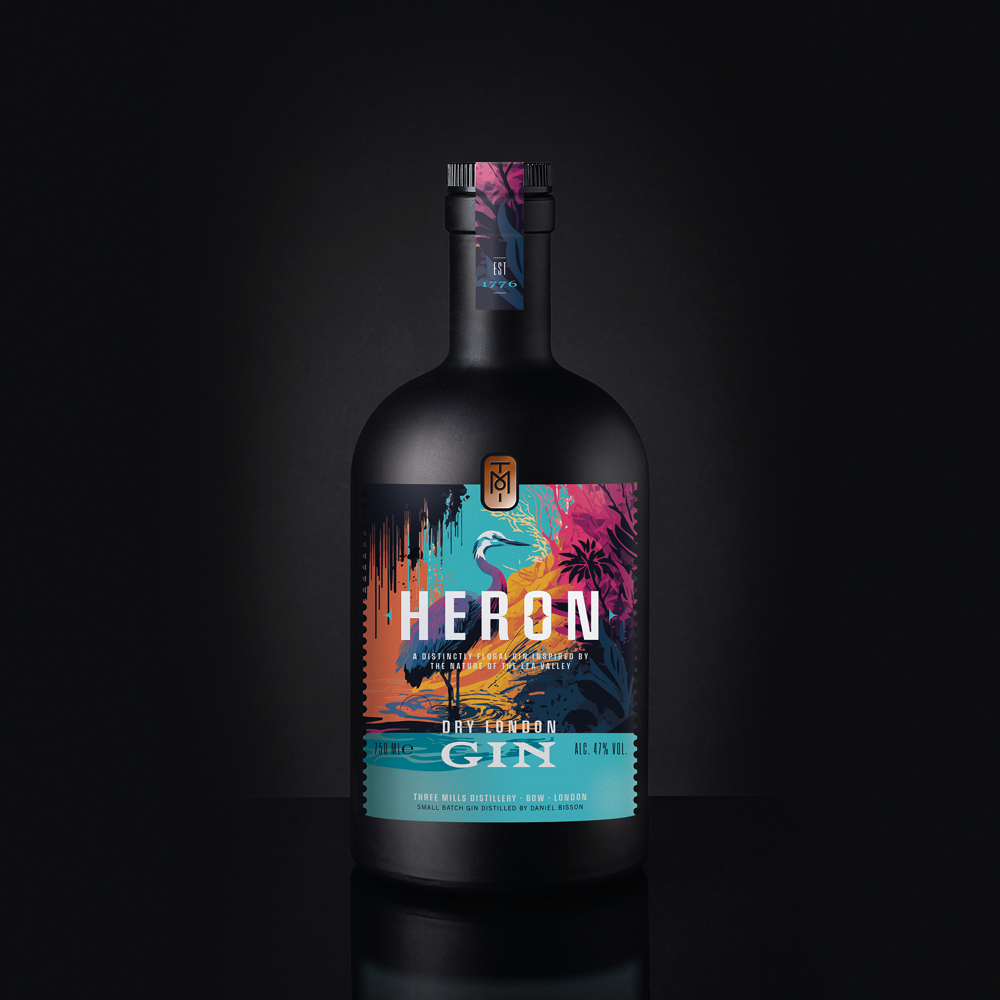
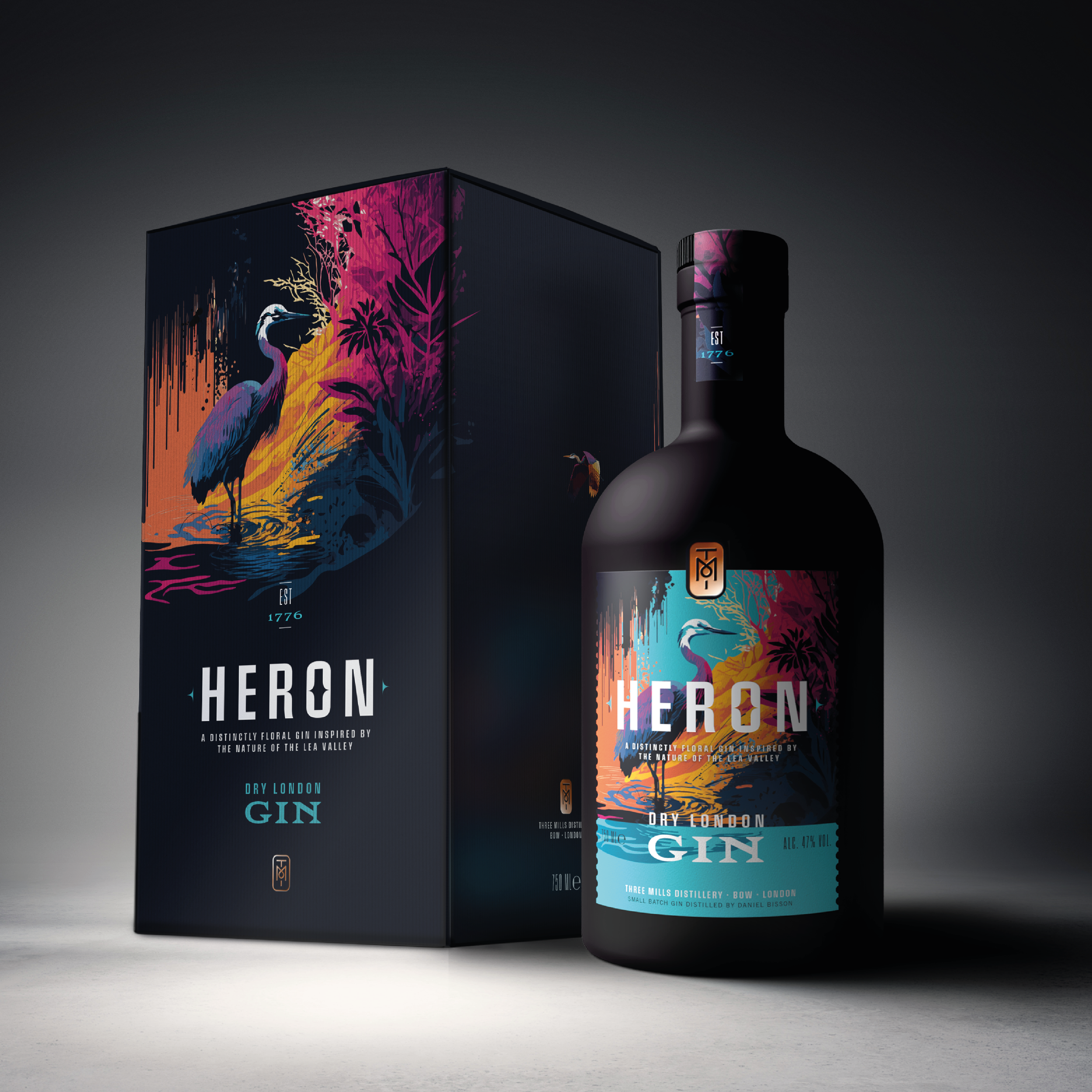
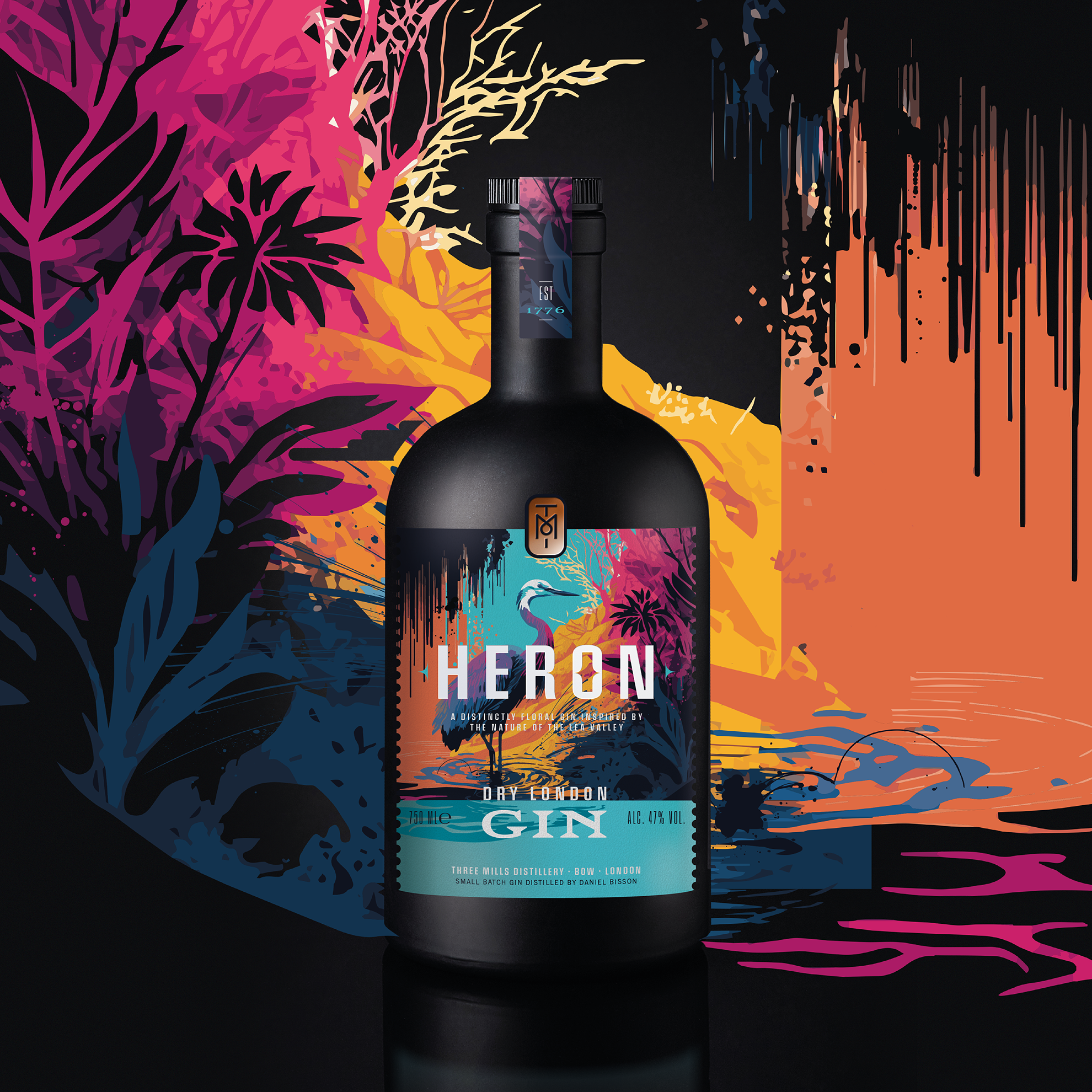
Heron is my 21st-century homage to that history – a distinctly floral London Dry, inspired by the nature of the Lea Valley, and the neighbourhood I call home.
The visual world of Heron is drawn entirely from its surroundings. The flora and fauna of the River Lea and Limehouse Cut – weeping Willow trees, wildflowers, the grey heron itself – sit alongside the raw textures of the canal’s industrial edge. Weathered brick, oxidised metal, and the vivid, unsanctioned colour of local graffiti: art that belongs to the street and the water in equal measure.
The palette reflects the landscape at its most unexpected – vivid magenta, warm yellow and orange cut through with unexpected flashes of colour, just as the canals themselves surprise you. Materials are tactile and considered, grounding the bottle in a place rather than a category.
The illustrations were initially prompted by Midjourney AI.
This is passion/concept project.
All rights reserved. All images are the intellectual property and copyright of GHDC Ltd 2023 ©