Nanric Road Fine Foods – brand and packaging revisit.
Based in the Bay of Plenty’s kiwifruit country, Nanric Road Fine Foods is a family-run business and has been tempting New Zealander’s taste buds for almost 25 years.
Whilst living and working in Wellington, New Zealand 25 years ago, I started a project to create a brand and packaging system for Nanric Road. Before I could complete any concepts I moved away and never got to see the final outcome. This is a personal choice to return to the project for a second time, and complete it in the way I had intended:
Twenty-five years is a long time to earn a place on someone's table. For Nanric Road Fine Foods, it's taken roots – deep in the volcanic soil of the Bay of Plenty, surrounded by the kiwifruit orchards and open skies of one of New Zealand's most quietly extraordinary regions.
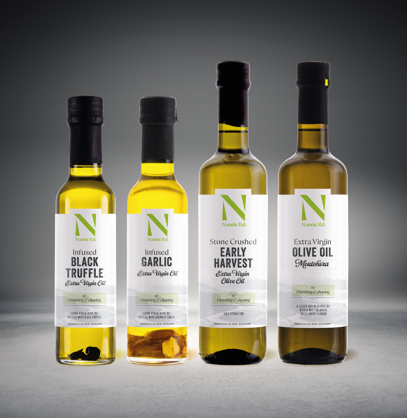
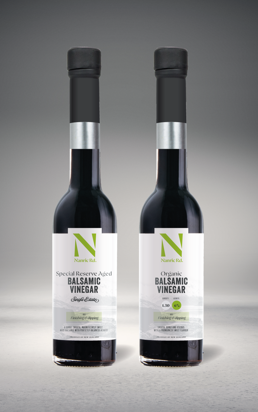
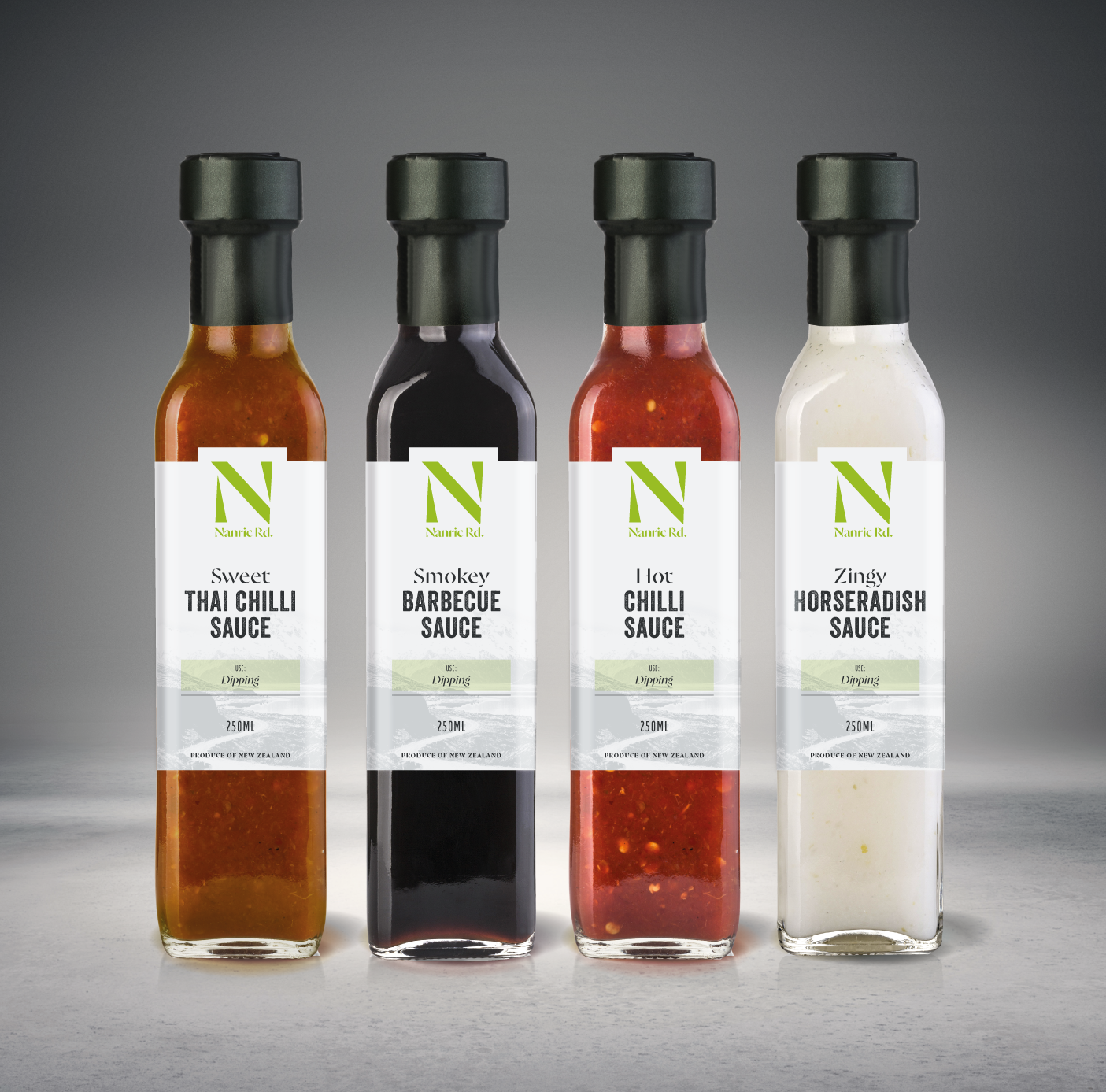
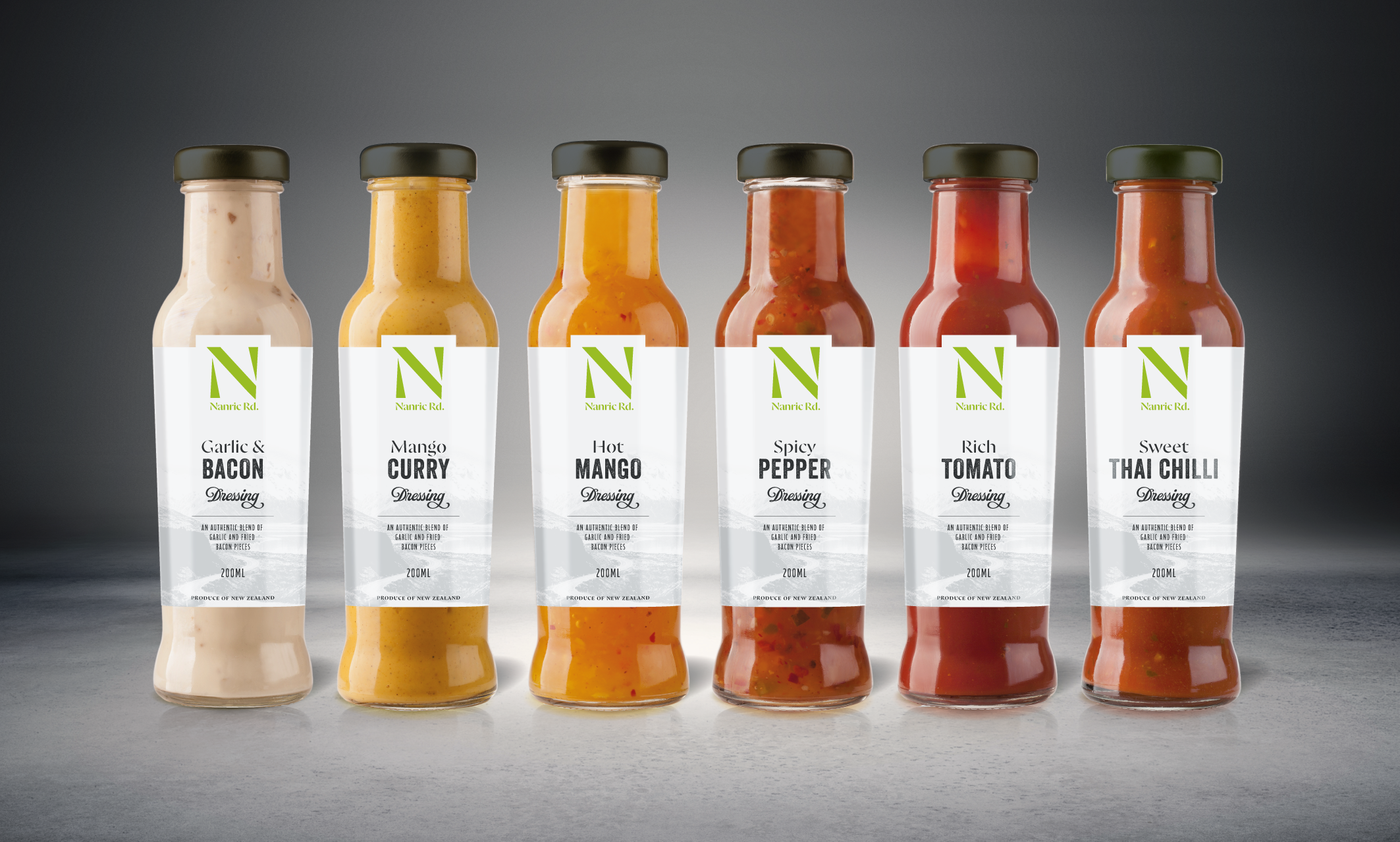
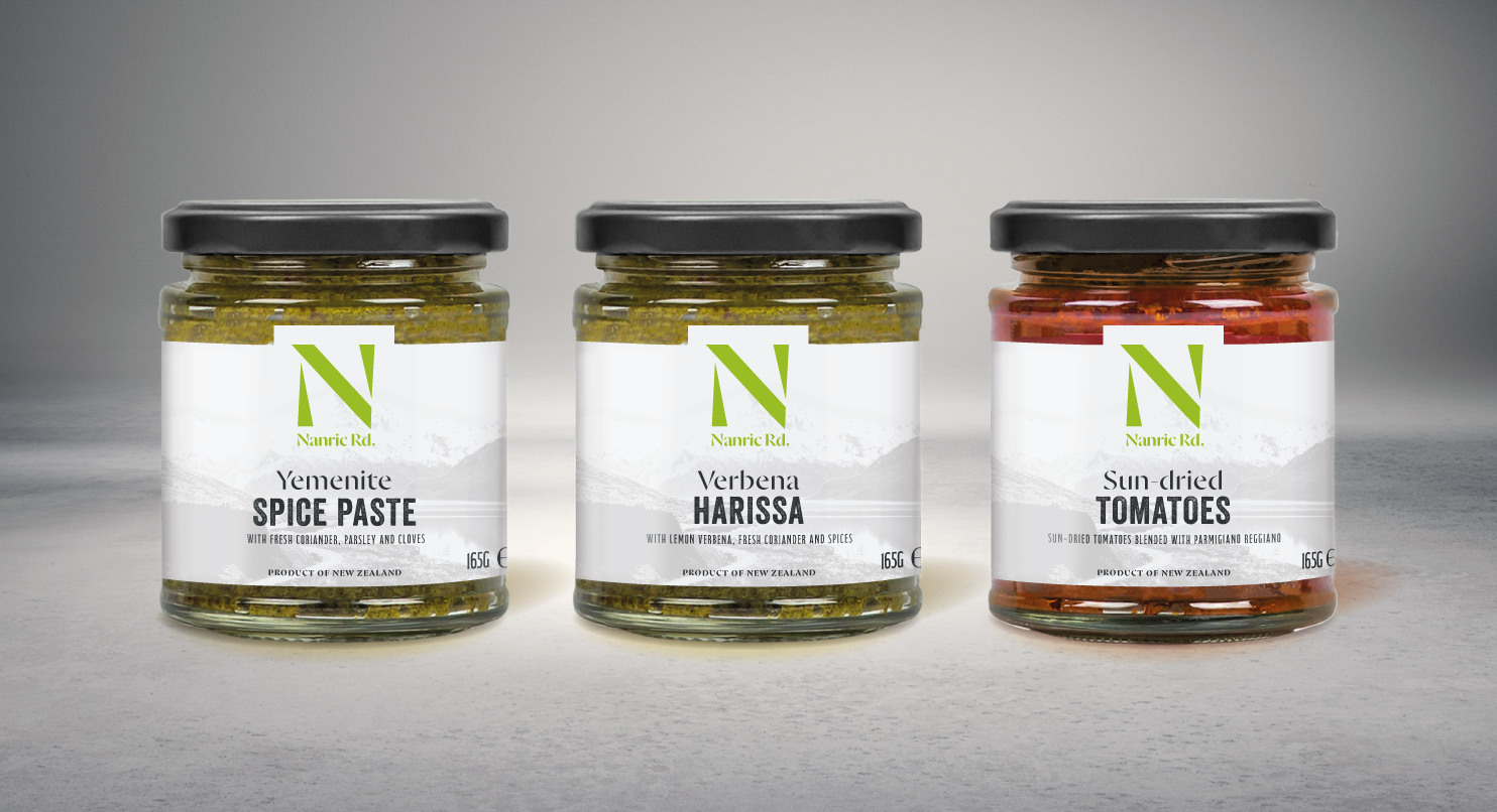
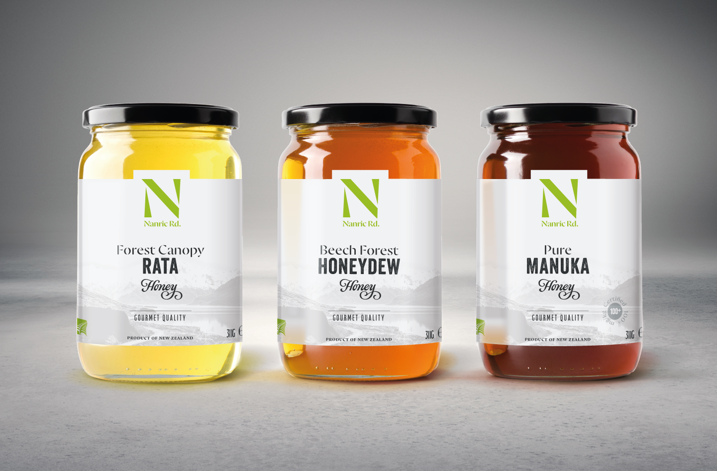
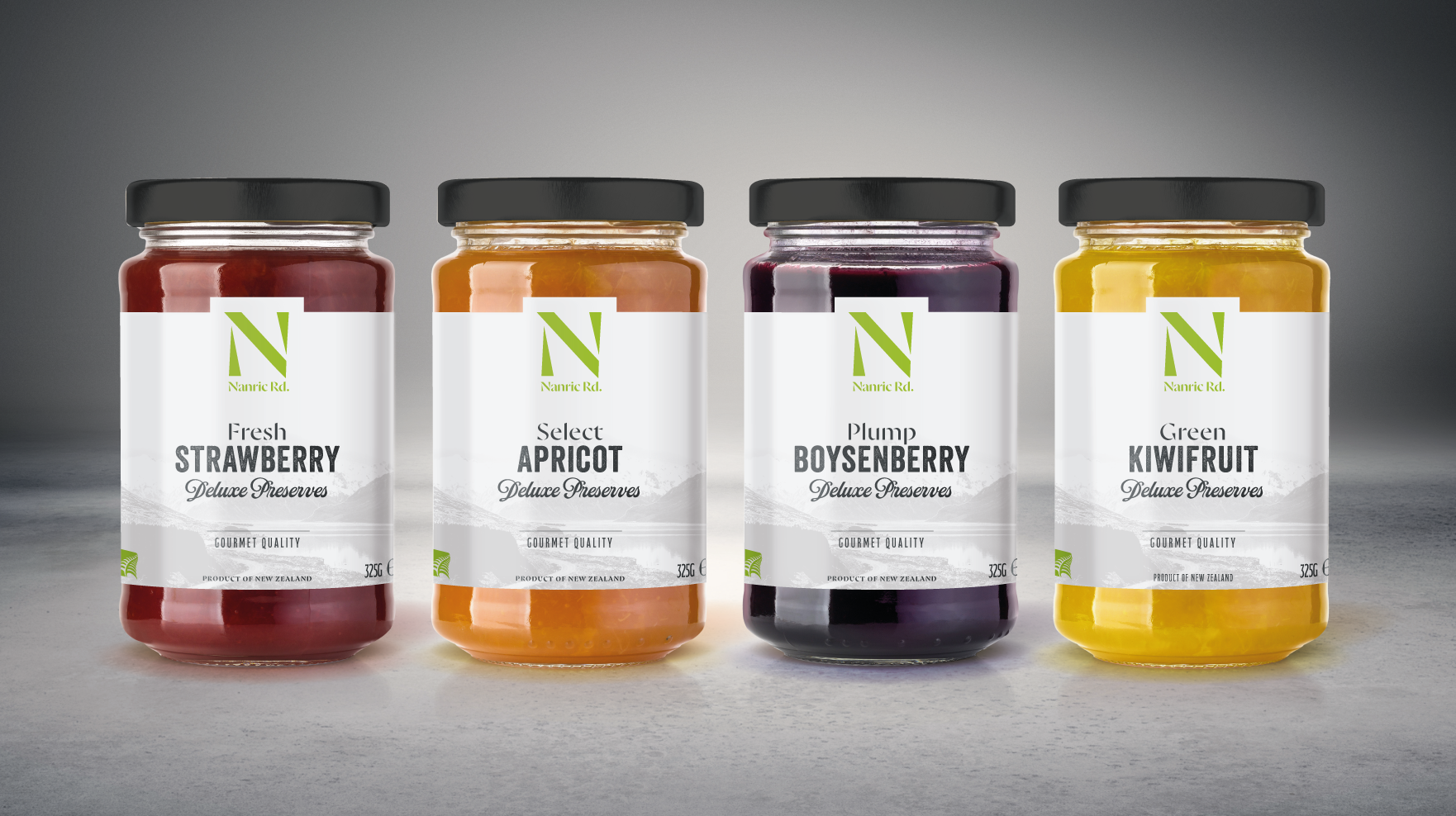
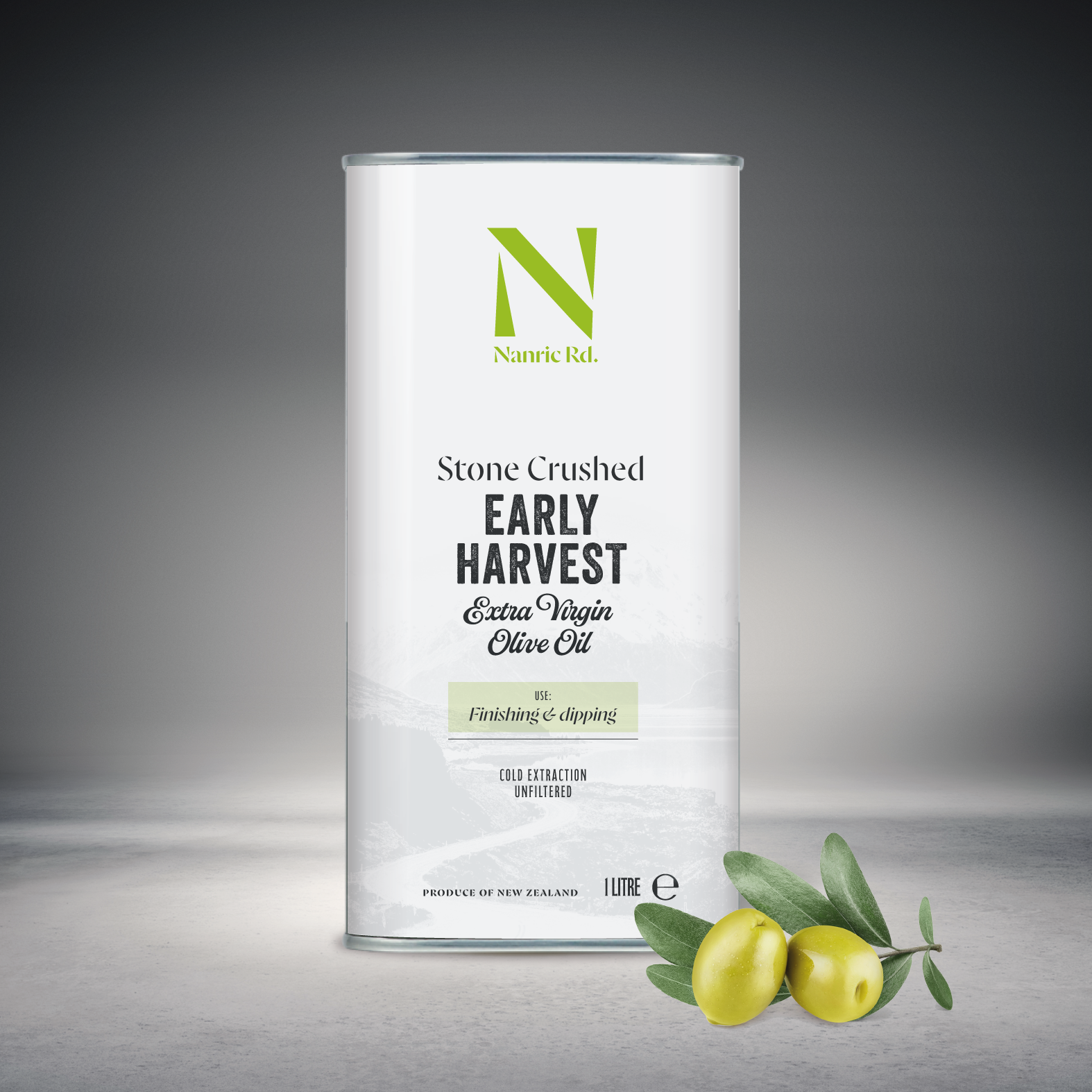
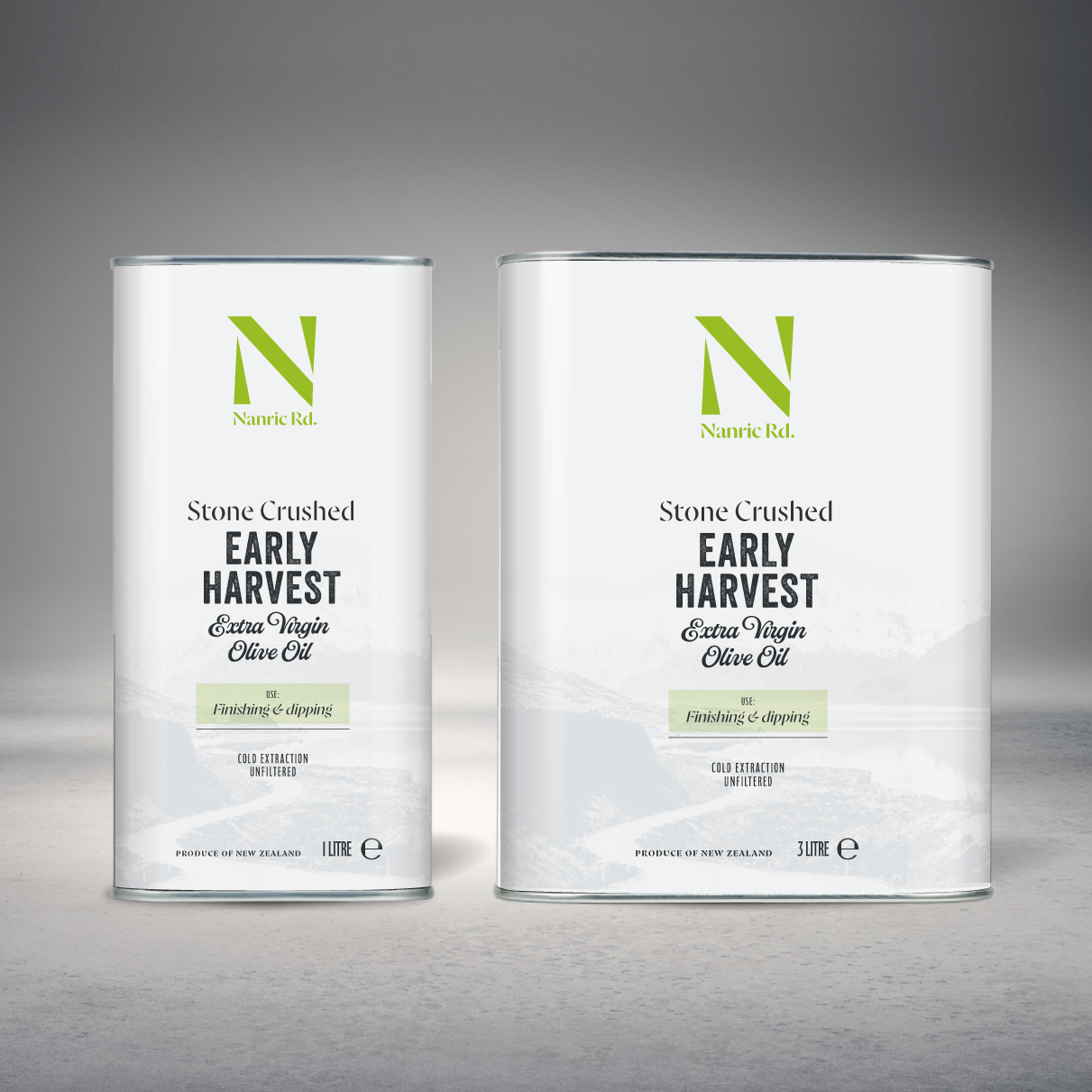
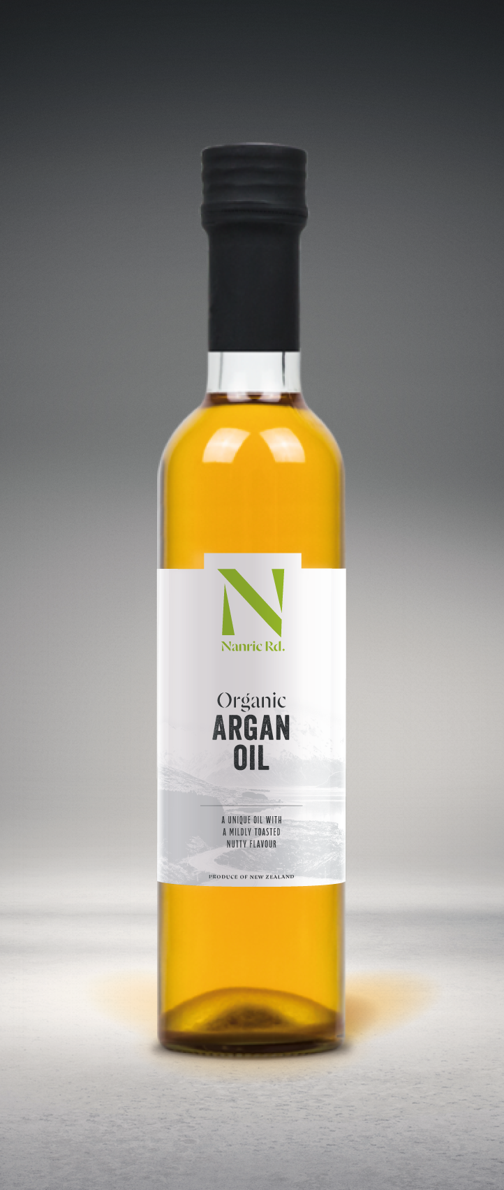
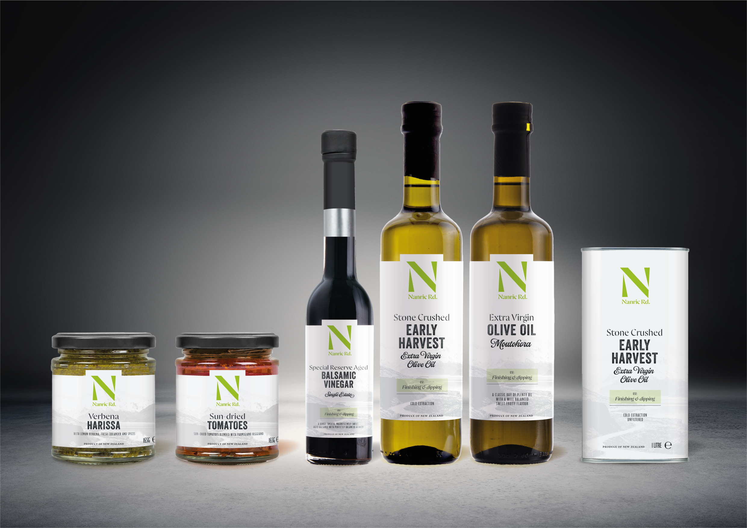
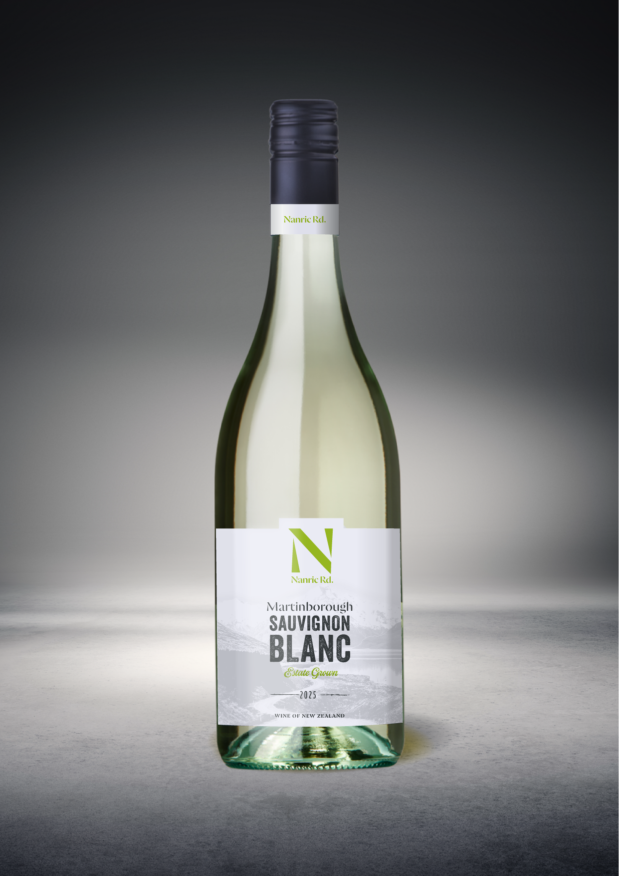
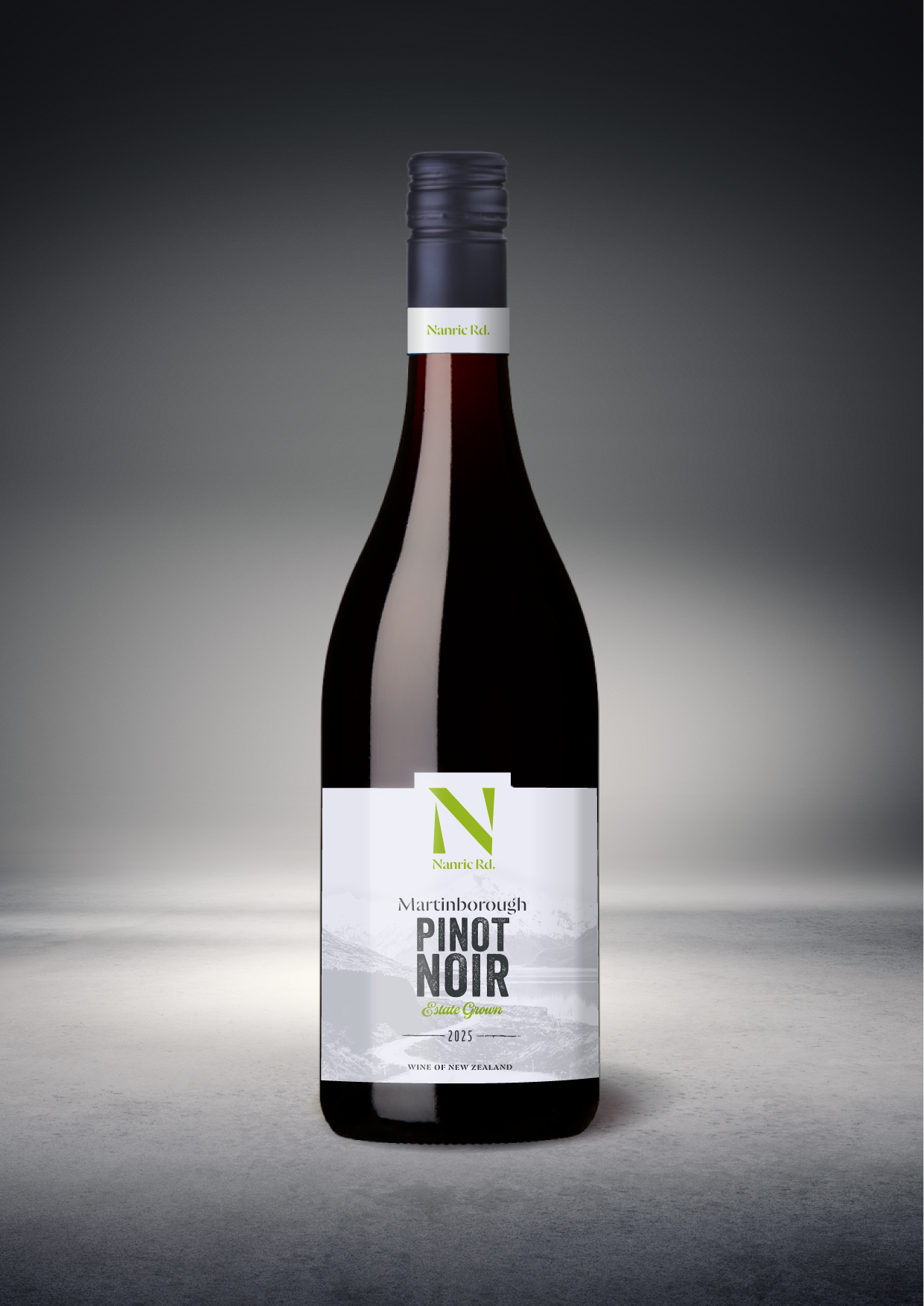
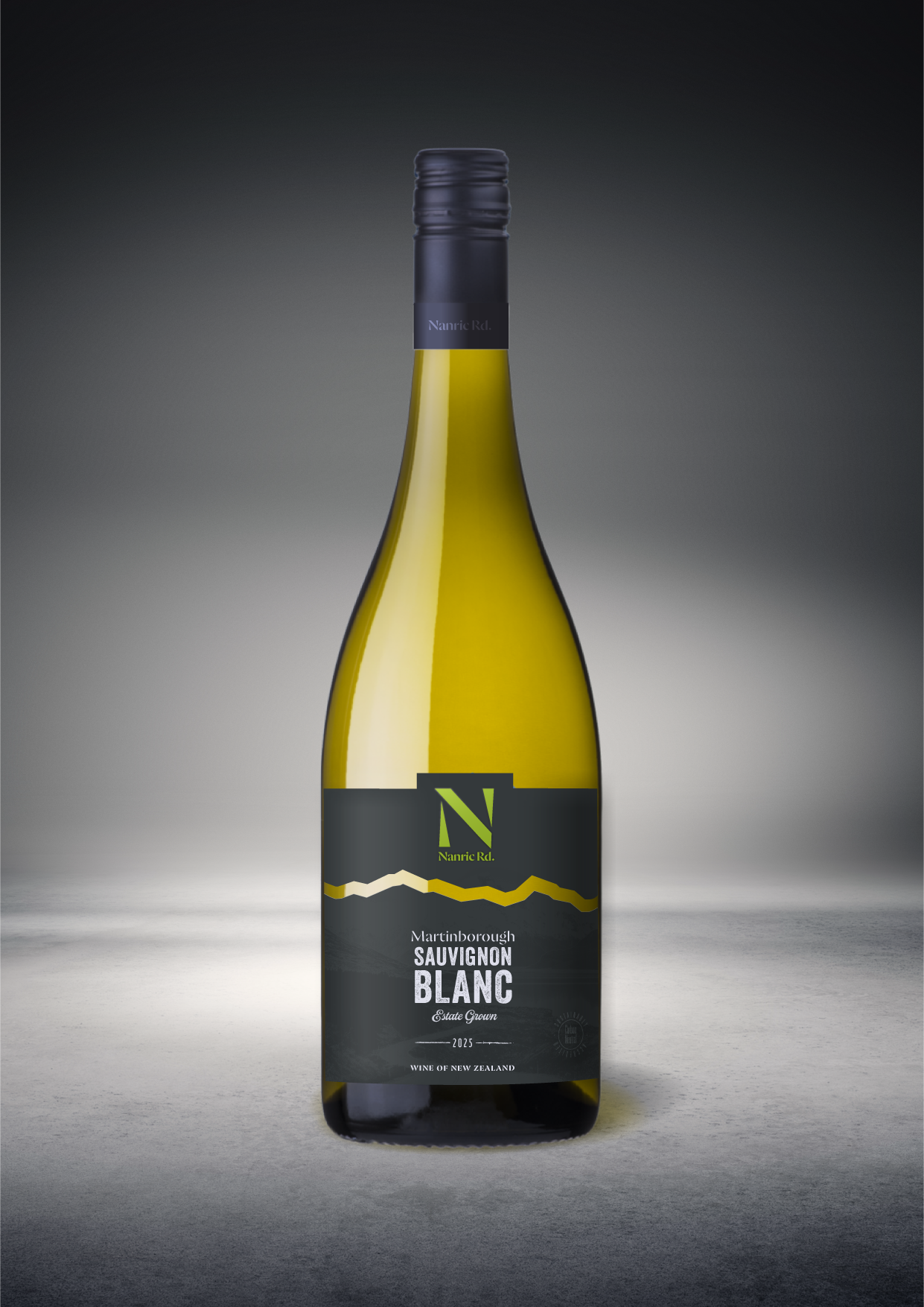
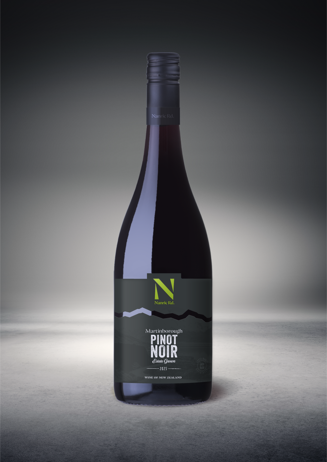
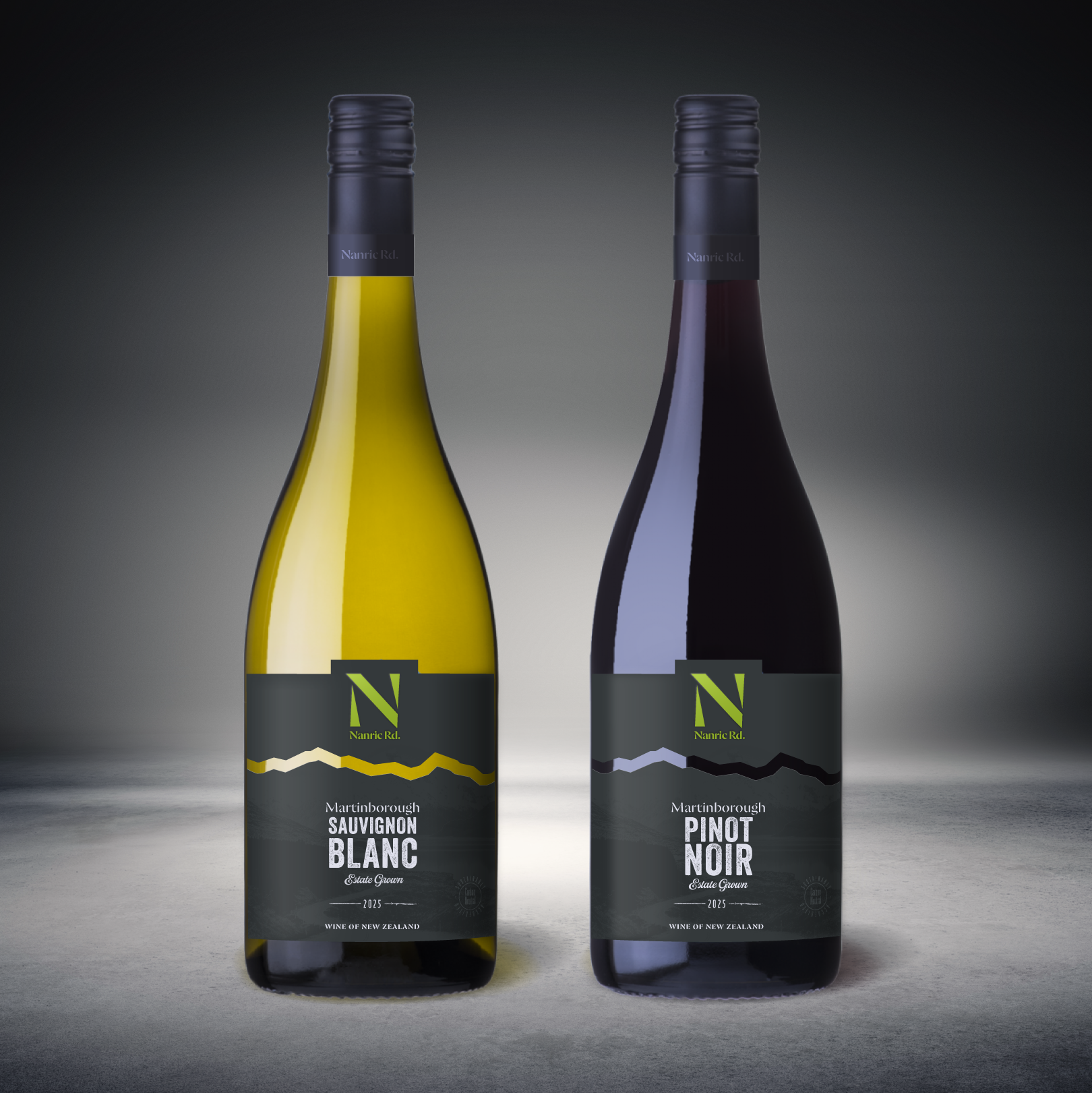
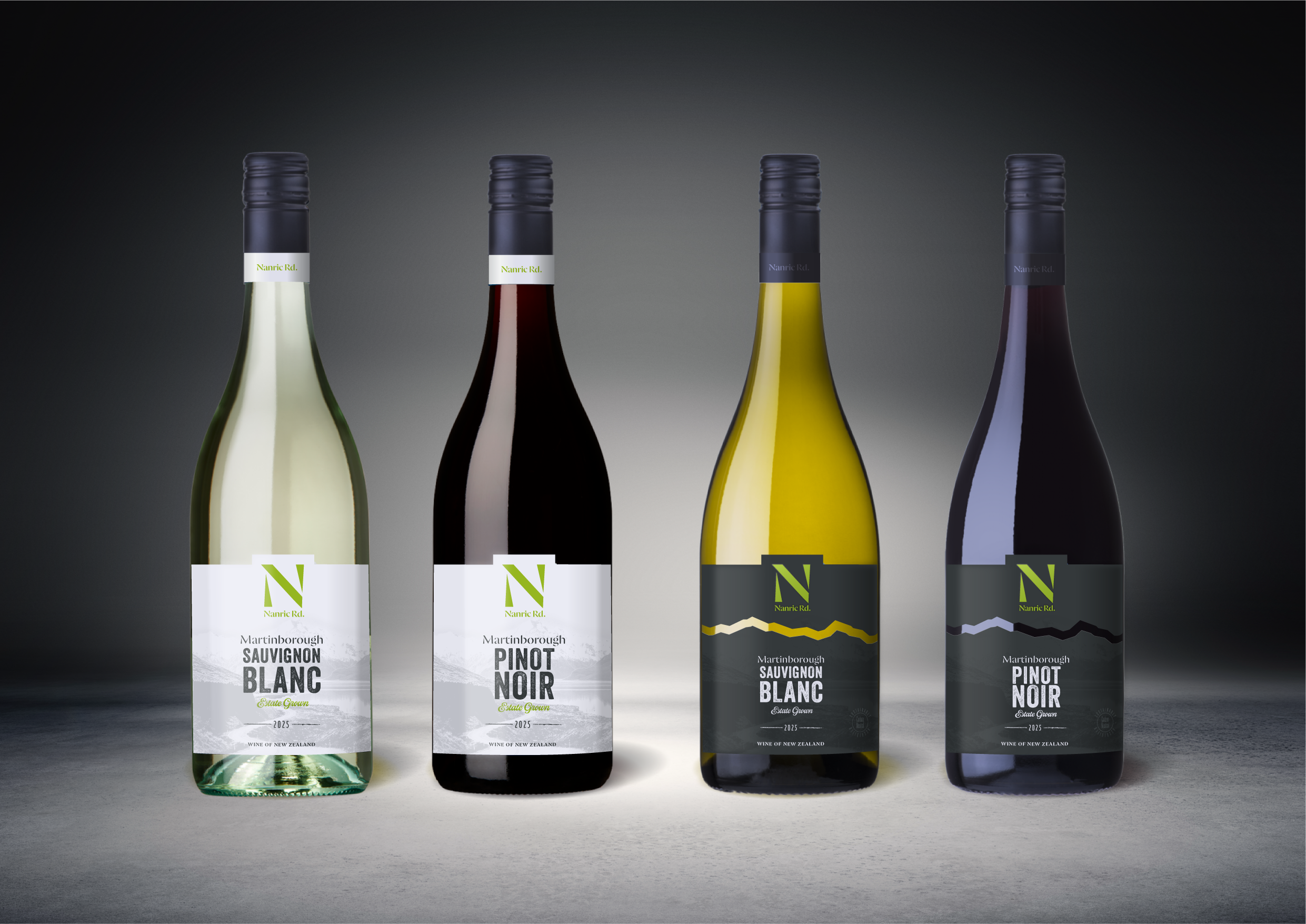
This packaging revisit was about honouring that legacy while giving it a new confidence. Bold enough to stop you at the shelf. Considered enough to tell the story once you look closer. The solution is disarmingly simple: a commanding green N, fresh, immediate, unmistakably Nanric, set against a crisp white ground. A striking sign-post of the new identity.
Behind the type, barely there but deeply felt, a faint monotone photograph of a mountain road recedes into the distance. A road that evokes both the provenance and the journey – the family, the land, and the twenty-five years of craft that brought everything here.
The result is packaging that feels like Nanric Road tastes: clean, honest, and quietly exceptional. From the olive groves to your table – nothing lost in translation.
It is in no way connected to or sanctioned by Nanric Road Fine Foods.
All rights reserved. All images are the copyright of GHDC Ltd 2026 ©