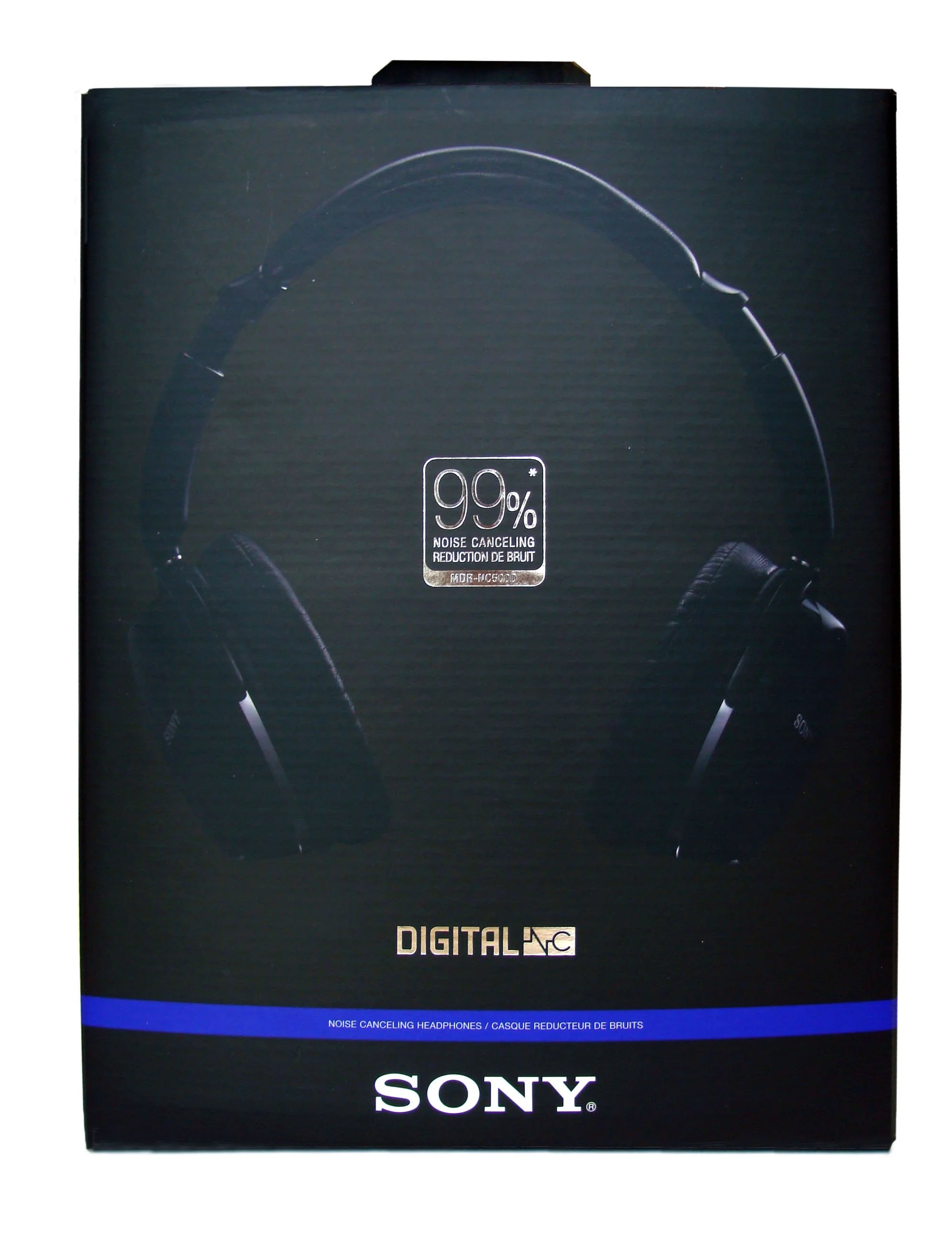
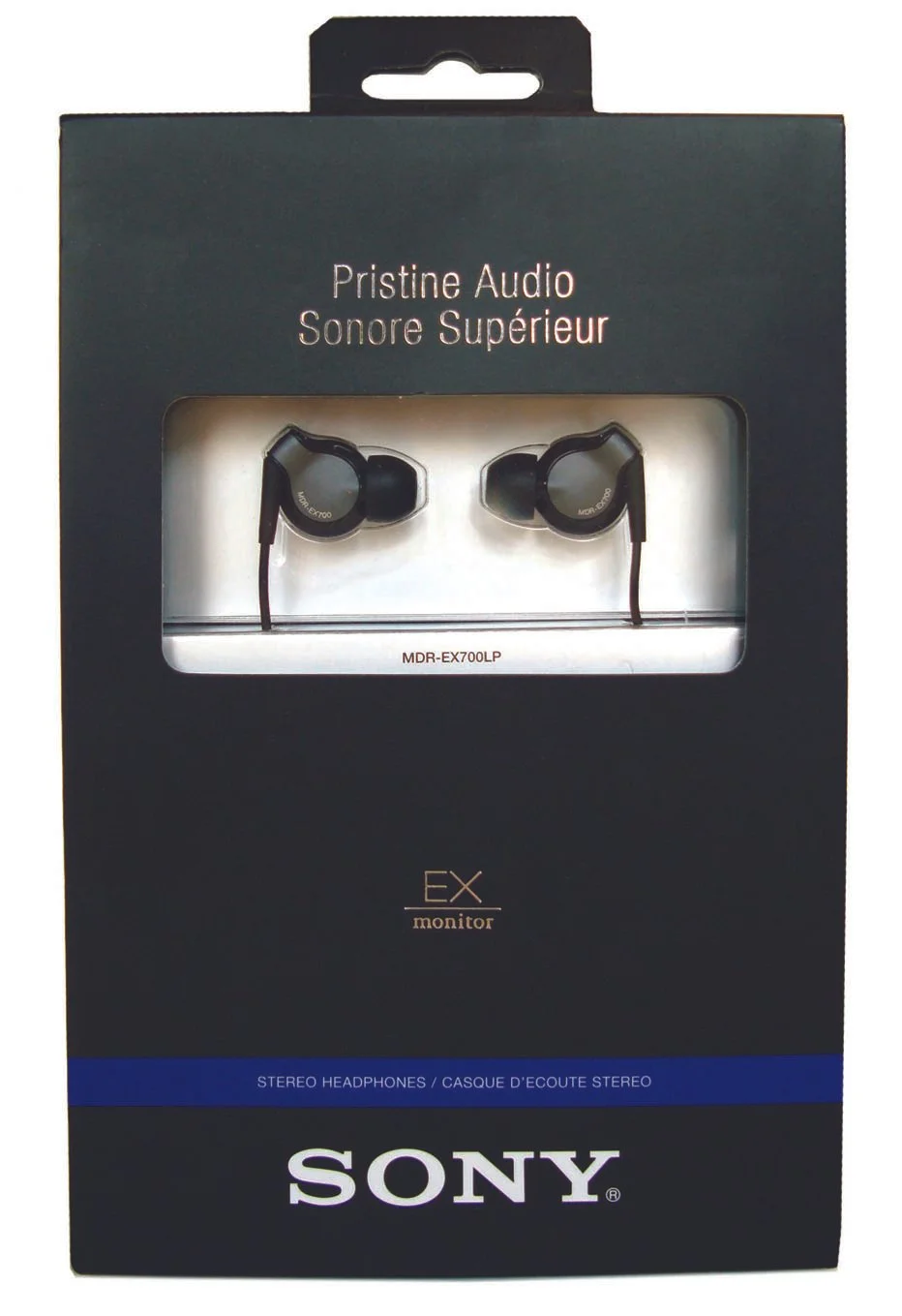
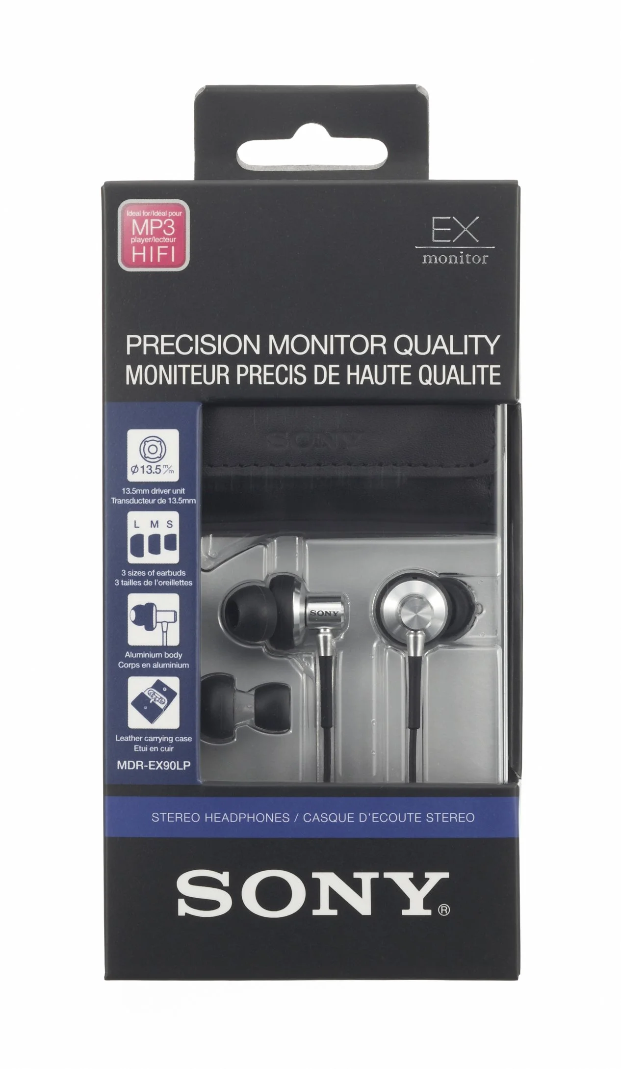
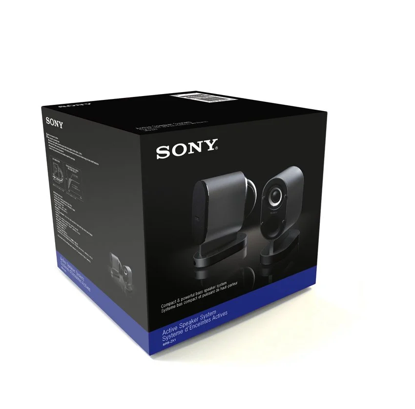
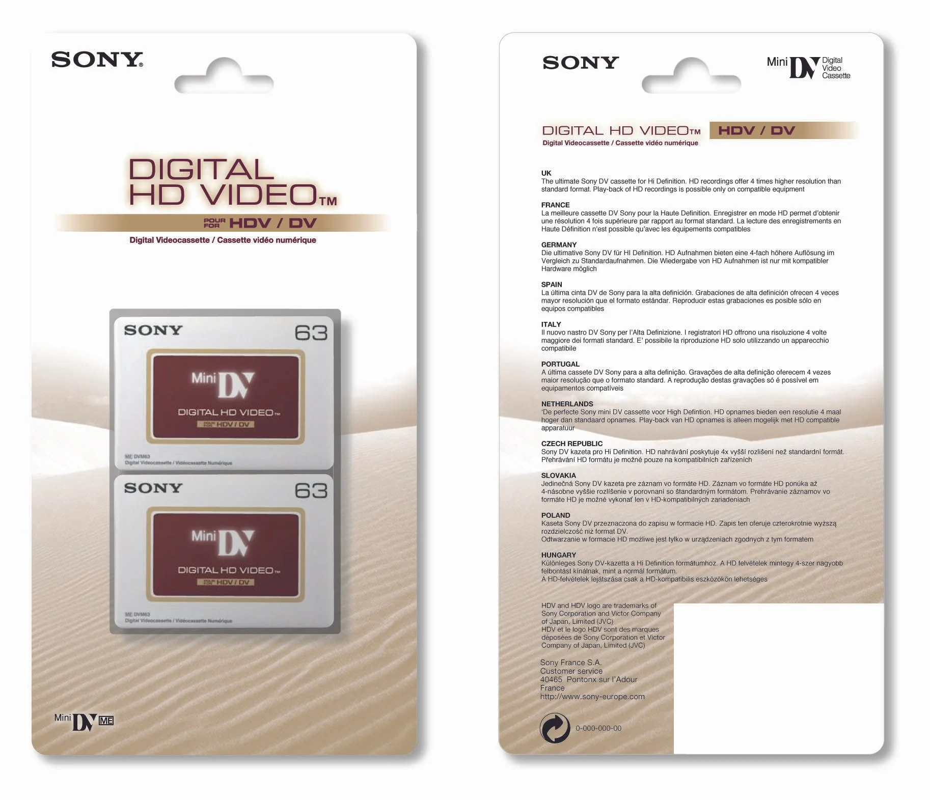
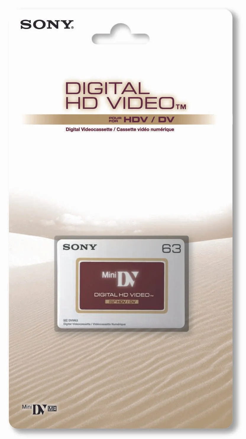
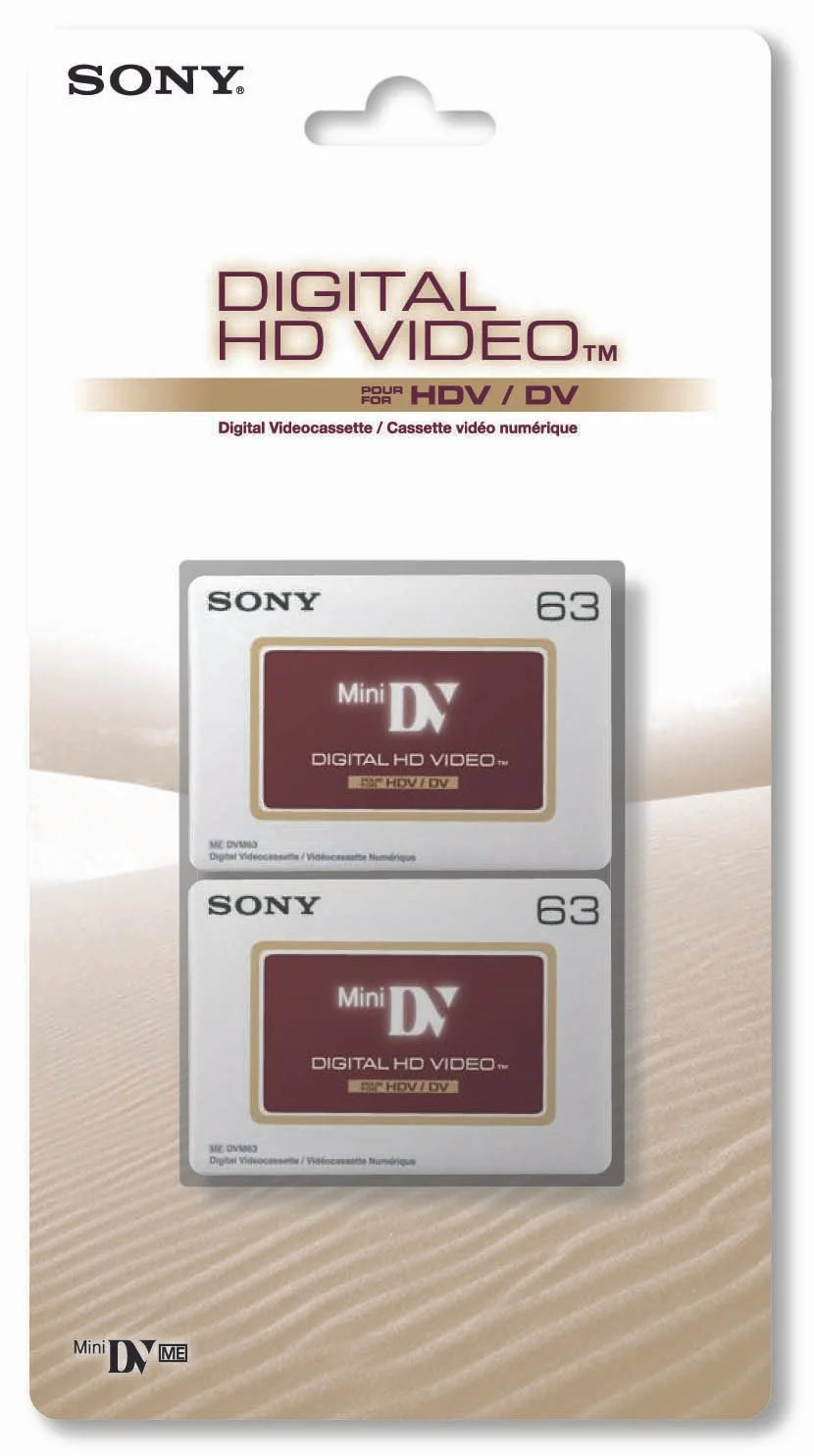
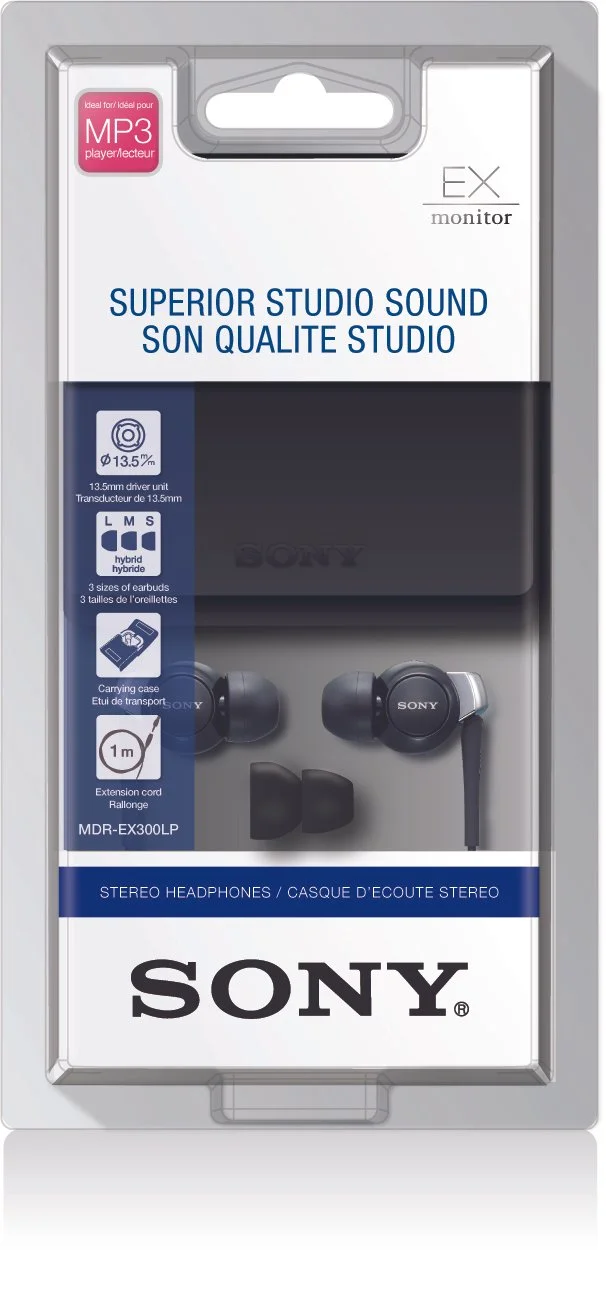
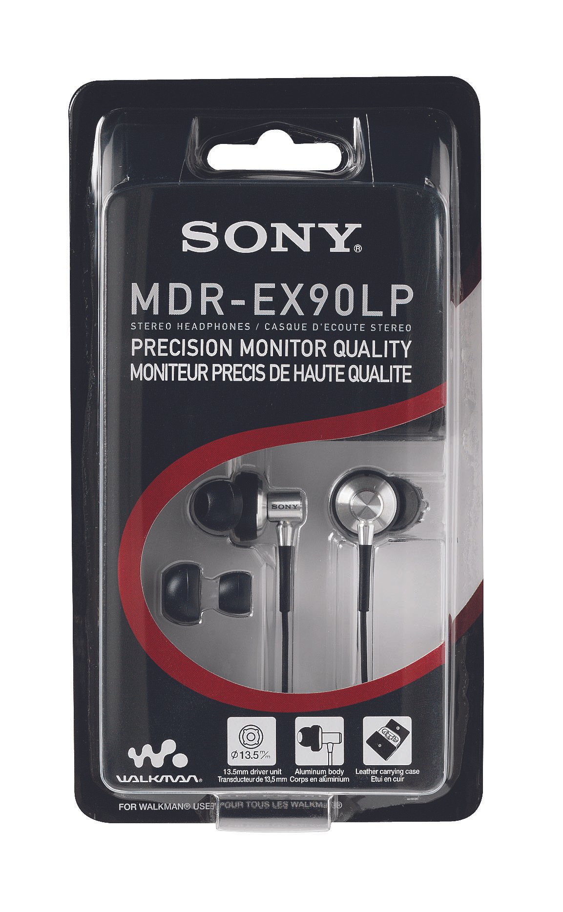
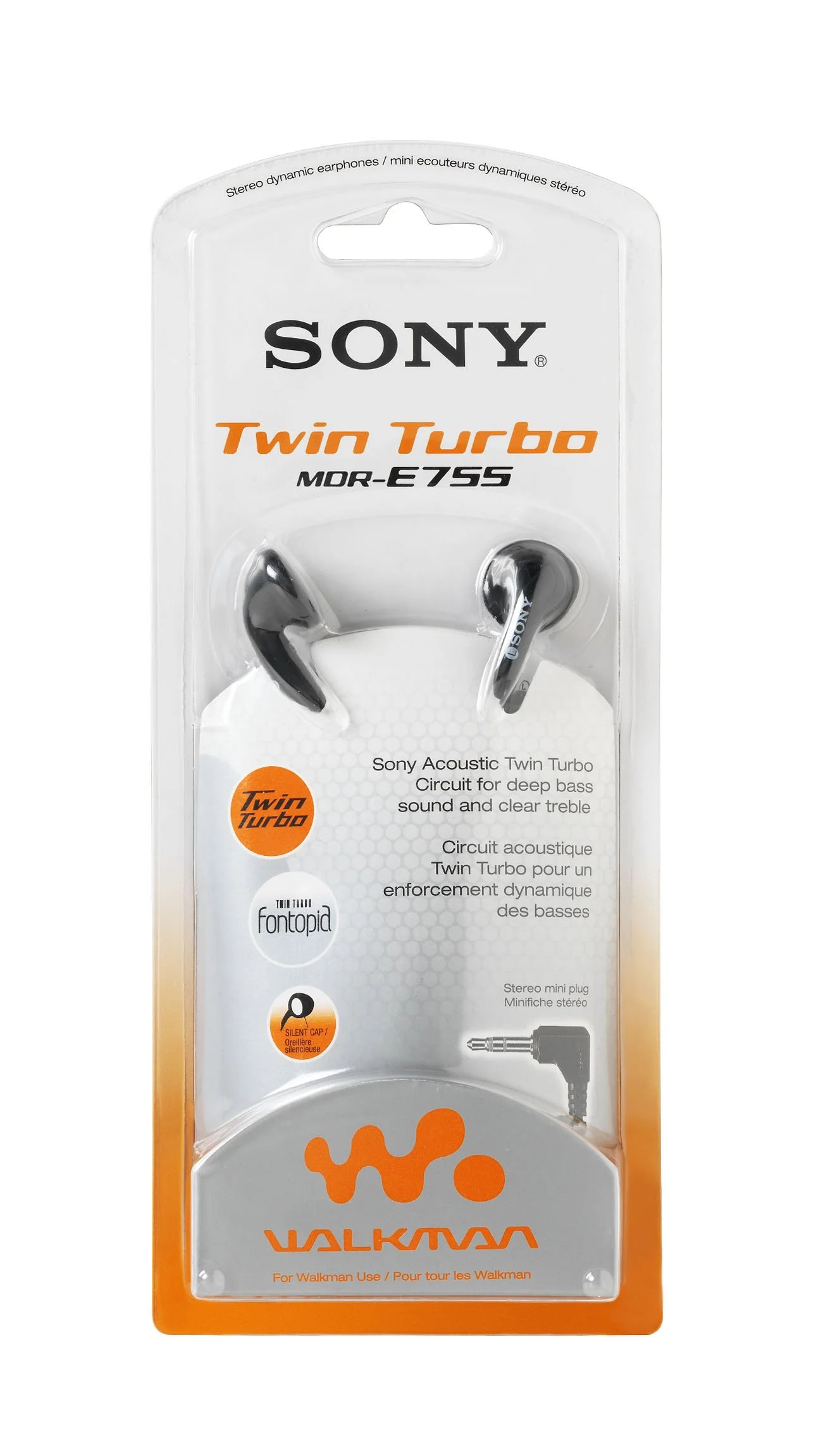
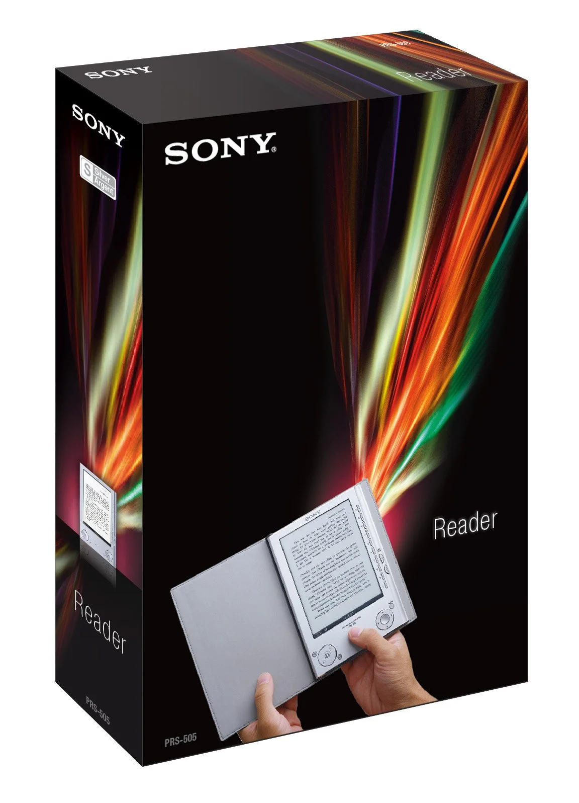
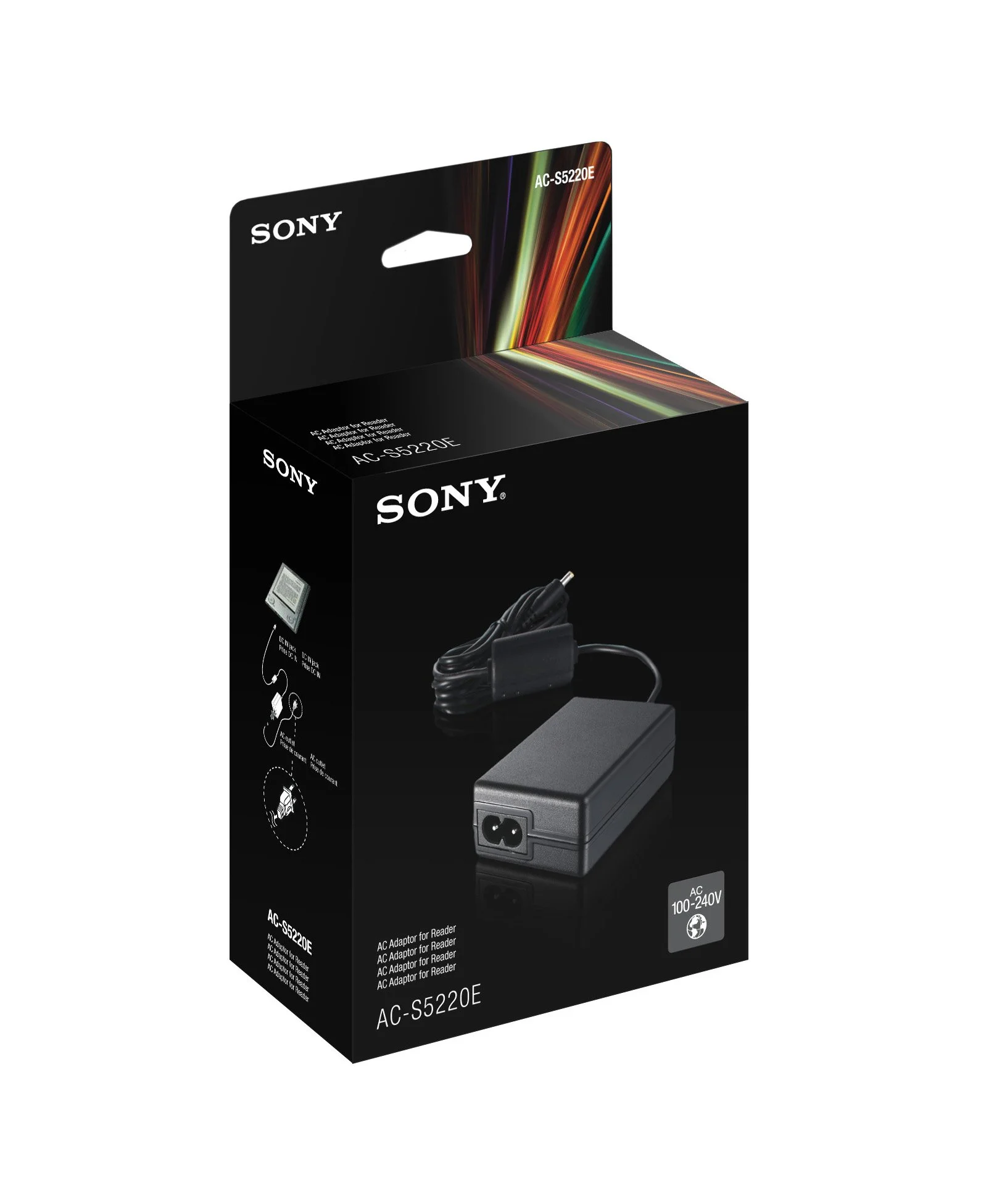
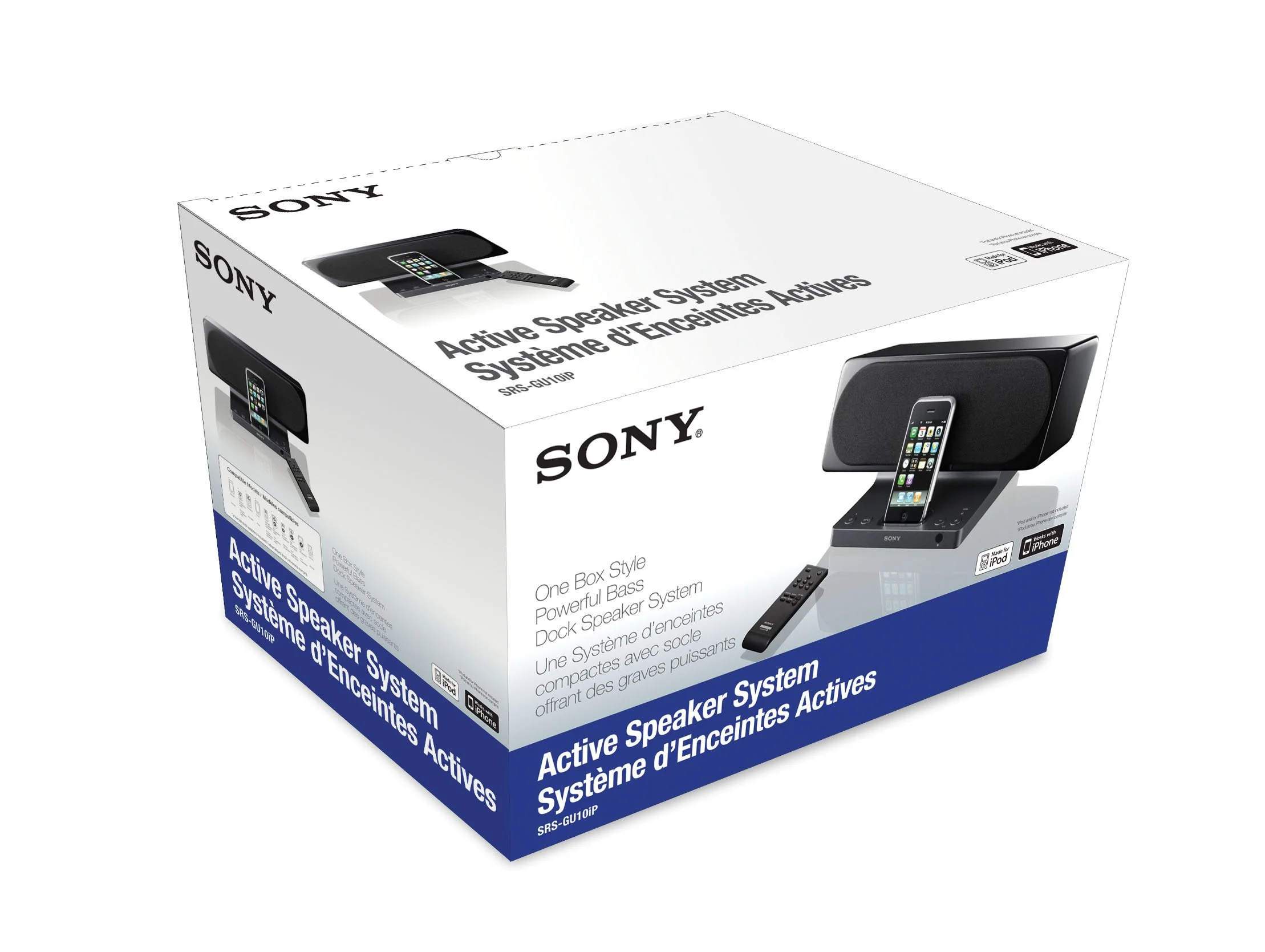
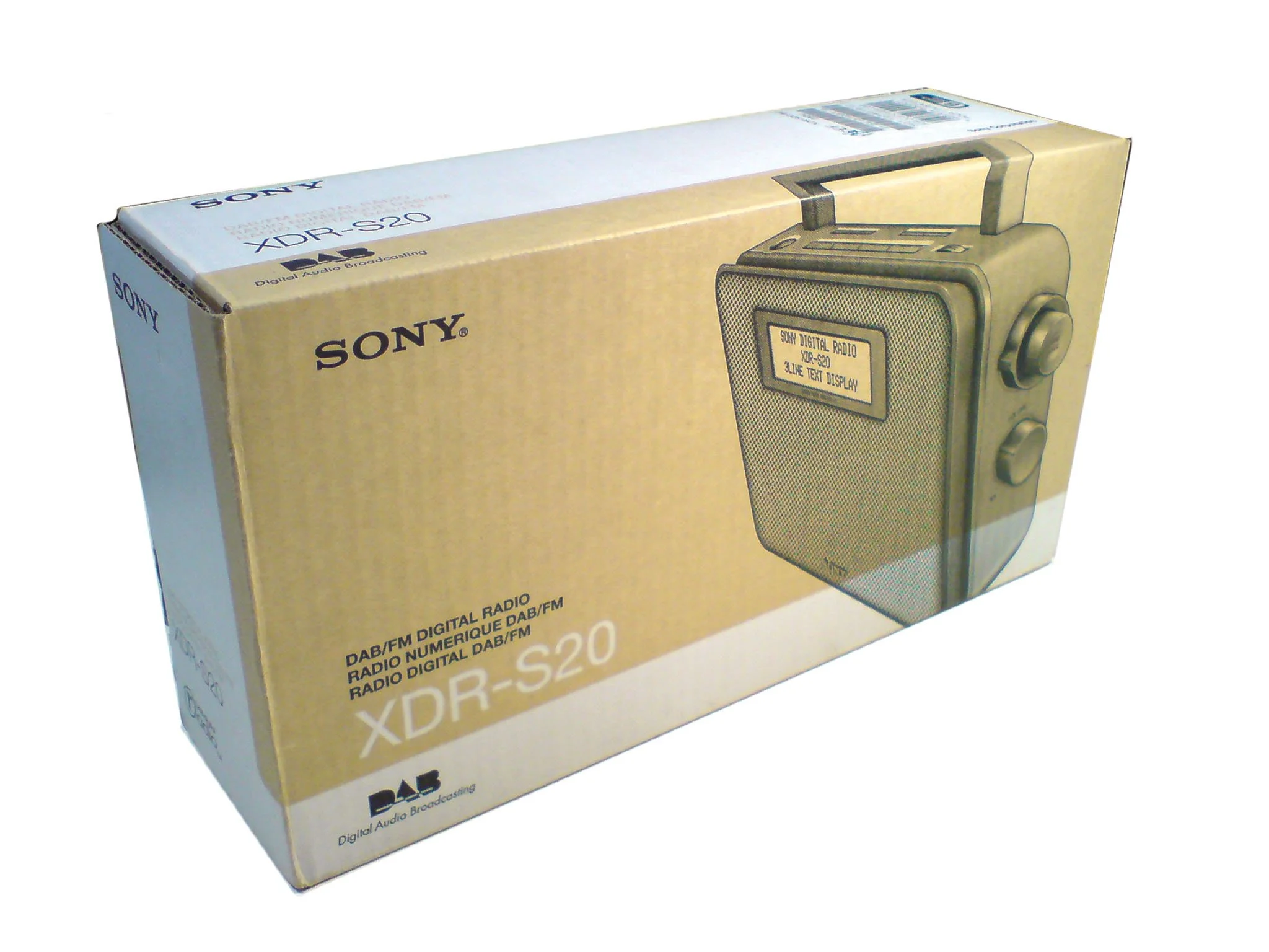
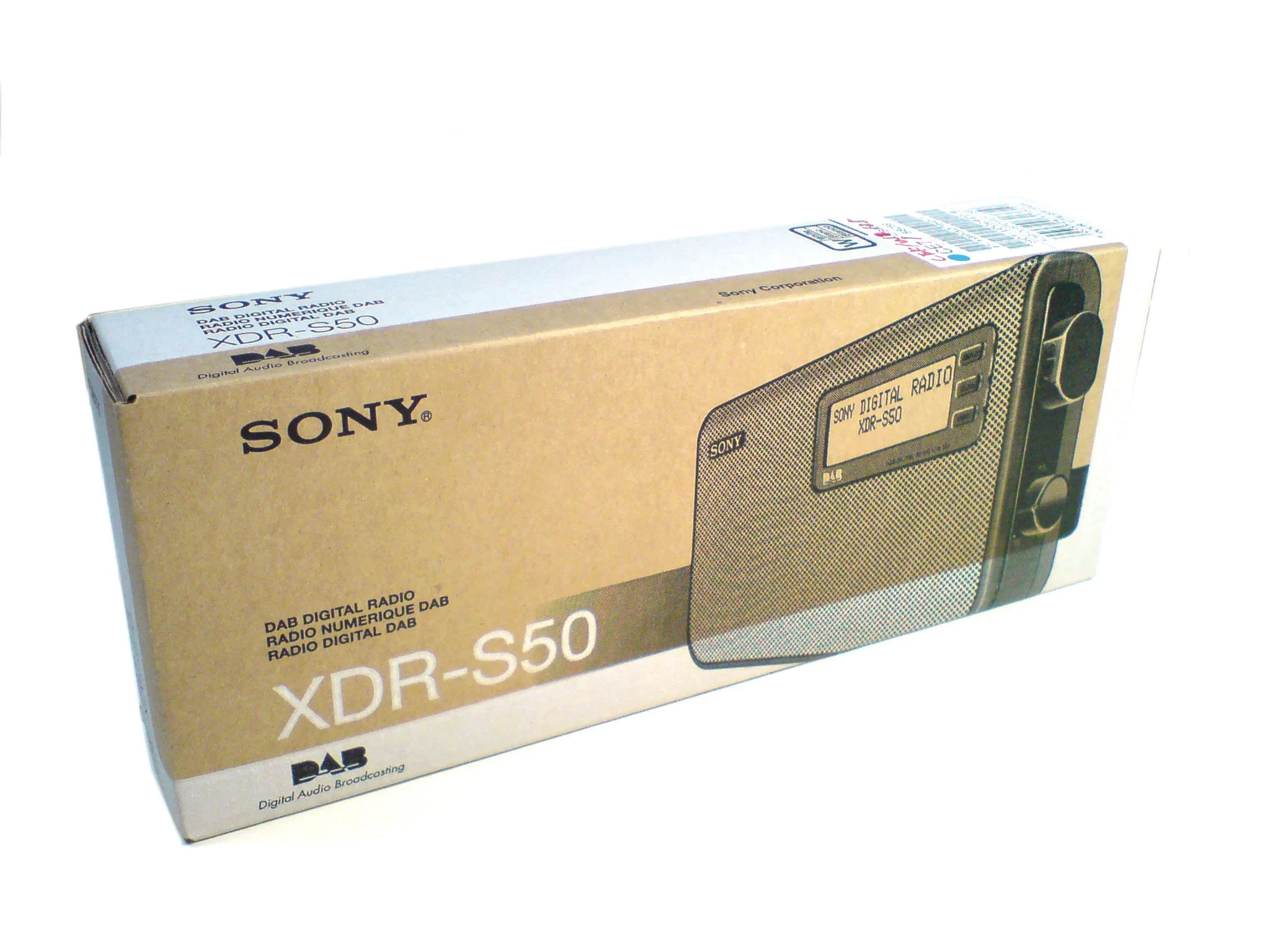
Sony packaging.
These various packaging designs were designed to command attention while reinforcing Sony’s reputation for precision and innovation. A bold graphic language, confident scale, and disciplined use of colour created immediate shelf impact without sacrificing sophistication.
Typography and photography were treated as primary design elements – clean, assertive, and purposeful – while high-contrast layouts and refined material finishes elevated the unboxing experience. Every structural and graphic decision was intentional, balancing visual power with technical clarity.
The result was packaging that felt distinctly Sony: confident, progressive, and unmistakably premium.